How To Choose Perfect Colors Every Time
Wouldn’t it be great if you knew how to choose exactly the right colors every time you started a new work?
How much more enjoyment would you get if choosing the right colors came easy?
I mean really easy, as in, “no more worries that your finished page won’t look right when you’re done” easy… No more stress in the middle of coloring, wondering which colors you should use to finish the job.
Sounds nice, doesn’t it?
That’s why I created a tool that is simple and easy to use, and allows any artist to pick the right colors for any subject, any time. The color picker I’m going to give you today is my own invention. You won’t find anything like it anywhere else. You also won’t find the color combination it generates in any book or color theory blog. To the best of my knowledge, the color combinations you’ll get by using this tool have never been presented as a unified “theory” anywhere before now.
Watch the video below to see how it works!
Don’t have Photoshop? Open this psd file inside www.photopea.com
Photopea giving you a hard time? Watch the video below to find out how to open it with Gimp.
Why It Works
I designed the color picker tool to select colors based on their relationship to the key color selected by the user. The main pointer, the one with the two dots, indicates the key, or home color. The two smaller pointers on either side of the main pointer select analogous colors, or colors that are similar to the key color. These analogous colors can be used to enhance or modify the look and feel of the key color without drastically altering its color identity. These three pointers can use the full range of value and saturation for whatever colors they point to.
Opposite the main pointer, there are two secondary pointers. Each of these pointers has a gray dot to indicate that any color they point to can only be used in its desaturated form. The placement of these two pointers in relation to the main pointer creates an easy harmony. Using red-orange as an example of the key color, the secondary pointers indicate blue and green as “complementary”. These three colors are known as split-complementaries, and their combinations are far easier to control than that of a true complementary pair.
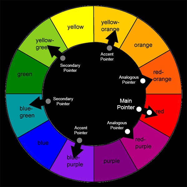
Amazing results can be achieved using only the five colors chosen by the main, analogous, and secondary pointers, but sometimes you just need a little more pop. The remaining two pointers indicate accent colors, and represent a true complementary pair. But since both pointers show gray dots, the colors they indicate are chosen from the desaturated chart. The addition of gray makes these colors a nice addition to the overall color scheme since they can only be used in their desaturated form.
In total, the color picker tool gives a range of 63 individual yet harmonious colors that work well together to create a balanced color scheme. It is important to note that once the color palette has been chosen, it is up to the individual artist to decide which colors, some, most, or all, to use in their particular work. One need not use all the colors available to them to make a work that resonates with beauty and harmony.
So there you have it. I’ve done my best to proved both the “what colors to use” and “why to use them” explanations for the colors chosen with this tool. Go ahead and give it a try. It does work, and once you use it I know you’re gonna love it.