In this week’s tutorial we will be learning the rendering techniques to create illustrative realism. The over all look and feel of illustrative realism was established in the mid 20th century by artists such as Gil Elvgren, Norman Rockwell, and others.
For this tutorial we will be studying the work of Gil Elvgren in particular. Mr. Elvgren is considered by many to be the master of the pinup style and it’s his work that most people think of when they imagine classic pinups.
Note: Mr. Elvgren’s illustrations are considered to be in the public domain and therefore not subject to copyright. The line drawing for this tutorial was hand drawn by me without tracing, but is faithful to Mr. Elvgren’s original work. Due credit is given to Mr. Elvgren for his images, and because his work is public domain, no copyright infringement is incurred in this tutorial or its related images.
Getting To Know Gil Elvgren
Gil Elvgren (1914-1980) was the most influential pinup and glamour artist of the twentieth century. His professional career began in the mid 1930’s and lasted more than 40 years. In that period he established himself as the favorite of pinup art collectors worldwide.
Elvgren stands out today not just for his paintings and advertising graphics. He was also a notable professional photographer and used his photography to capture his poses and lend realism to his work.
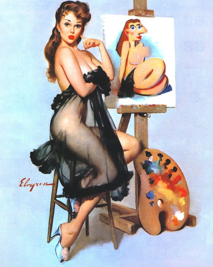
But to say Elvgren’s images are “photographic” is to do the artist a disservice. When asked about his techniques, he explained the distinctive touches he added to every painting, how he increased the bust, lengthened the legs, pinched the waist, made mouths fuller and more expressive, and warmed up the over all flesh colors to create radiant glowing skin. These “touches” give the artist’s work distinction and can be readily observed in the images below.
![elvgren-pin-ups[3]](https://copicmarkertutorials.com/wp-content/uploads/2016/07/elvgren-pin-ups3.jpg)
As you can see, to call Elvgren’s work “realistic” is really not accurate. His girls are more “perfect” than real, more “ideal” than photographic.
Real art is always an amalgam of fantasy and reality, and it’s that amalgamation that breathes life into Mr. Elvgren’s work.
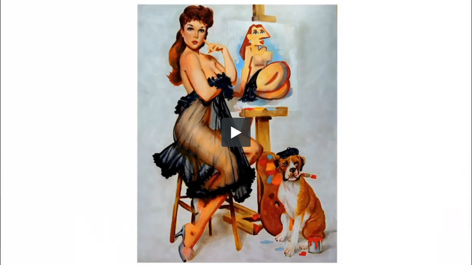
The inspiration for this tutorial was painted by Mr. Elvgren in 1962 and originally titled “Your Choice (Me)”.
The line drawing below is the one we’ll be using today, and for this tutorial I’ll be coloring her dress.
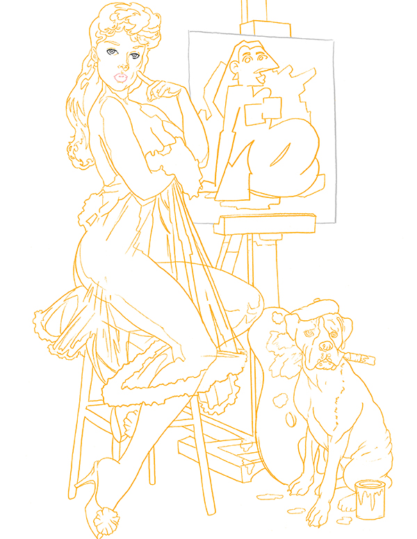
I call this type of line drawing a “disappearing line drawing”, since as the work progresses the lines virtually disappear as colors of similar or darker value are laid next to and over the line drawing.
“Lineless” drawings allow for a great sense of realism, since in nature, natural objects aren’t bounded by black, bold lines.
However, some care must be exercised by the colorist when rendering such an image. Since the lines are designed to disappear, one must be careful not to “lose” them too early in the work and by extension damage the placement or proportions of the elements within the composition. Let’s take a look at how this works as we tackle one of the more difficult areas of the drawing, the transparent dress.
Coloring The Transparent Dress
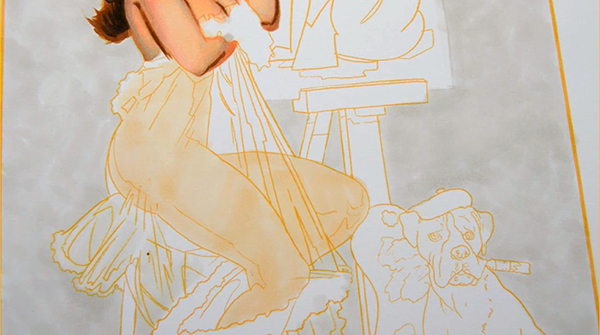
Since the dress is transparent, it’s important to indicate the skin underneath first. To begin, I lay in a flat of E51. I take no care to ensure an even, streak free layer since the subsequent layers will cover most of the initial base.
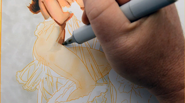
Next I indicate the the darkest areas of shadow. I’m using an E97 and E39 successively. These areas should be bold and dark. There is no need to worry about bleed since a soft edge in this area will only enhance the illusion of realism.
![]()
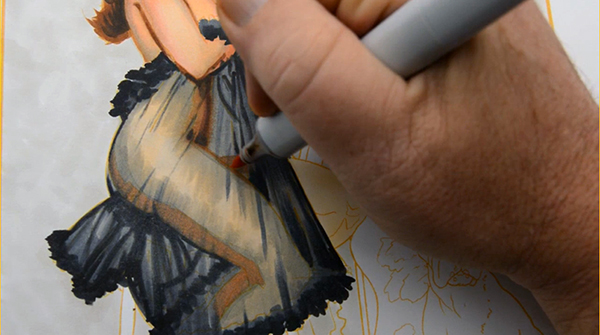
Using a warm gray (W1), I begin to block in the basic shapes of the folds in the dress. I use long linear strokes in the areas under her arms to help create the illusion of long flowing fabric. I also use this color to indicate the shadow plane on the underside of her leg.
Notice how rough and unblended these strokes are. It is a common misconception that alcohol markers must be blended wet in wet to get good blends. This simply isn’t true. You can always blend a stroke no matter how dry it is so long as enough ink is placed over it to reactivate the color below.
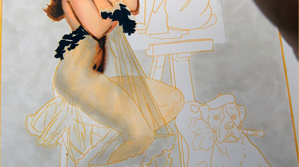
At this stage I begin to indicate the upper hemline of the dress. This part of the dress is super frilly as it’s composed of multiple layers of fabric placed one on top of the other.
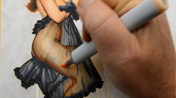
Again, notice how rough and unblended the strokes are… this is important to give this area a feeling of softness. Most often oil paintings such as the one we are using for inspiration are composed of unblended brush strokes laid one over the next, and by mimicking this technique with our markers we can remain true to the source. I’m using pure 100 Black in this step.
Still using the 100 Black, I begin to place the long folds of her dress. This area should be thought of as being composed of long geometric shapes with hard edges.
 I continue placing the shapes of the folds along the bottom part of the dress. Pay attention to the hard and soft shapes you see here. All of these were created with the same pure black marker by varying the pressure and speed of the individual strokes.
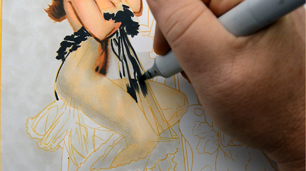
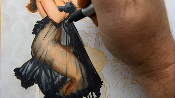
In this step I’ve switched to a W4 and pulled the color up and over the body beneath the dress.
I add YR02 to the underside of her leg and to the contour line at the top. As you can see the line work form the original image has all but disappeared, so it’s important to restate it every now and again until the work is progressed to the point where the lines are no longer needed.
I’ve used E39 to darken the shadow on the near leg, and now I blend and refine the forms of the body and dress alike. I move back and forth between the various markers I’ve used to this point until I get just the right levels of contrast.
Once I have the basic forms and contrasts in place, I use a 0.5 multi liner to strengthen the hard edges of the folds.
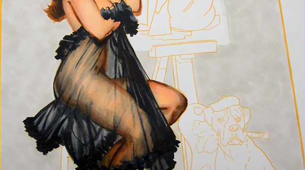
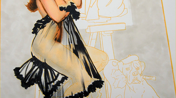
The completed dress is a study in both hard and soft edges, as well as softly blended and unblended areas. It’s important to realize that our viewers respond to contrast, so leaving some areas rougher than others creates an overall image that is satisfying to look at.
How helpful was this tutorial?
1 Star: Oh man, that sucked… 5 Stars: Good God, it’s brilliant!
![]()
![]()
![]()
![]()
![]() (48 votes, average: 4.58 out of 5)
(48 votes, average: 4.58 out of 5)![]() Loading...
Loading...

This one is amazing Chris!
I actually WAS wondering how you rendered that transparent material, copics are amazing things once you know how to use them like that!
Thanks for the awesome tutorials!
-V. Rush
Thanks, Vince!
Thank you so much for your tutorial, I can see how I could apply this to other transparent objects. Please keep up the amazing work!
That’s awesome! I try to make these tutorials as versatile as possible. Makes me super happy that you can see yourself applying this technique to other transparent objects 🙂
Great tutorial on transparency!
Thank you, Tina 🙂
You are the very first person I have ever heard (of course I am not a artist but I play with Copics) say that you do not need to been out your Copics. In my little crafting world everyone says blend blend blend but of course it is not being a artist, it is just making greeting cards. Wow that was amazing to me. Thank you for that information. Shows the difference in what a true artist does and what we do with the Copics. Amazing work.
Hi Sharman, what an awesome comment! Thank you very much. I’m super happy to provide an alternative perspective to over-blending and boring three-marker color schemes. I’m very happy to have you here and I’m glad that you found this tutorial useful 🙂
It’s fascinating watching you build up layers. You make it seem so easy.
I hope Copic keeps you well supplied because you are, without question, the best advertisement for their product I have yet to see, and I’ve watched a lot of so called, Copic turorials.
It’s easy to see why you work professionally in this medium.
Wow, thank you for the kind compliment. I really appreciate it! The truth is, we have no affiliation with Copic or the Too corporation. I buy all my Copics one at a time just like everybody else 🙂
Hi Christopher! I know this is part of another tutorial called “Pinups & Puppy dogs”, and I’d love to have it. I tried to buy it, but it’s out of stock, and I’m not sure how much will it cost to deliver to my country. Is there a digital version of it?
This tutorial was fantastic. Thank you for sharing your incredible talent with us. What a gorgeous finished product!
This was just what I was looking for. Excellent work. Thanks.
Hello, What kind of marker and color did you use to outline the illustration?