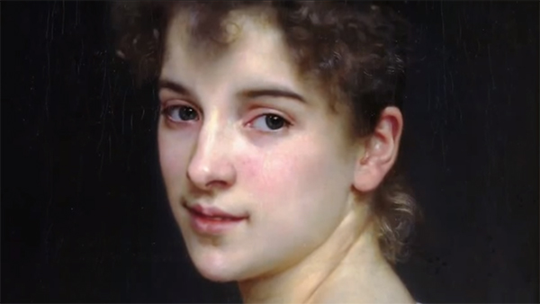
Coloring skin tones can be one of the most challenging subjects for beginners and longtime colorists alike, and while there are plenty of tutorials out there on the subject, all of them seem to approach the problem from pretty much the same place, using pretty much the same markers.
The colors most often used are E00, E01, and E03. While there is nothing intrinsically wrong with that particular combination for coloring Caucasian skin, those three colors do not even begin to approach the complexity and subtle color shifts real skin exhibits. To be clear, we are talking about Caucasian skin color here. Ethnically diverse skin tone will be the subject of a future post.
How Real Skin Gets its Color
Real human skin color is the product of many different substances and environmental factors. The primary function of skin pigmentation is to regulate the amount of ultraviolet radiation the body absorbs. Lighter skinned people are generally located further from the equator where UV concentrations are lower. With less need for UV protection, the body produces less melanin and the skin becomes more or less colorless.
Because of the lower melanin count and because of skins natural translucency, the reason light skin appears to be any color at all is because of the bluish white connective tissue under the skin and the hemoglobin circulating underneath.
It stands to reason then, that if Caucasian skin color is primarily determined by the bluish white connective tissue and the reddish purple color of oxygenated hemoglobin, we need to include blues, reds, and purples in our color palette anytime we color light skin.
With this in mind, a basic Caucasian skin tone pallet should include these colors:
E. E00, E01, E50
R. R00, R11
RV. RV000, RV00
B. B0000, B000 (the B family is super important, so don’t skip it)
This color palette opens up the possibility for coloring more natural looking skin colors since these colors begin to take into account why skin looks the way it does. With the blues and purples we can begin to replicate the colors that actually influence the way we perceive skin color, and since Copic marker ink is translucent, we can layer these colors under our Es just like they are under the skin on a real person.
You may have noticed that all the colors listed are light in value. In all likelihood, every other tutorial on skin tones you’ve ever seen suggests that a range of value is a must. The reason I have not included any darker colors on the list is because unless you’re a coloring a picture with a Rembrandt style light source, they really aren’t necessary. Believe it or not, in real life your eyes don’t see dark shadows on skin very often at all.
Your Camera is a One-eyed Monster and a Liar
Now I know what you’re thinking – you know for a fact that you have seen people with dark shadows on their faces!
Well, technically that’s not true…
Oh, I’m sure you seen tons of photos of people with dark shadows on their faces, but photos always lie. A camera only has one lens, and while it operates very similarly to a human eye, your camera only has one “eye” to view the world with. It is also important to note that no matter how sophisticated a camera’s lens is, it is nowhere near as sensitive as a human eye and it’s even worse at compensating for low light or high contrast situations.
By contrast, human eyes are super sensitive and our brains are amazing compensators. In a real life situation where there actually are areas of both strong light and strong dark shadows, our eyes balance the two extremes, making the light areas appear darker and the dark areas lighter.
Try this: The next time you are outside around mid day when the sun is high and casting harsh shadows, take a minute to analyze the people that you see. In these conditions there really are washed out highlights and super dark shadows, and if you took a picture, your camera would record that. But what a camera sees and what your eyes see are very different. Under these conditions it is impossible to see with your eyes what the camera records. Your eyes are just too sensitive. In fact, the longer you look into an area of dark shadow, the lighter it will look to you.
So for now, let’s leave behind the darker colors. When it comes to light skin tones we won’t need them.
If you would like to receive personal feedback on any work you’ve created using the methods I’ve explained here, you can upload your image in the comment section below, or if you have any questions or comments, please feel free to leave a reply!
How helpful was this post?
1 Star: Oh man, that sucked… 5 Stars: Good God, it’s brilliant!
![]()
![]()
![]()
![]()
![]() (14 votes, average: 4.29 out of 5)
(14 votes, average: 4.29 out of 5)![]() Loading...
Loading...

I didn’t believe it till I tried it. I would’ve never thought purple would make my skin tones better. Looks very demensional and natural. Love this!
Yep, pretty cool huh? The crazy colors actually exist in real life and when you learn to see them for what they are, all kinds of possibilities open up to you!
Wow! I never really thought about using warm and cool colors against eachoter rather than changing values, thanks!
I’m glad you like the idea! Using warm cool contrasts is a way more realistic way to color than using value. Technically value is an indicator of the direction of the light source, but not of roundness of form. Where things get really cool is when you use both value and warm/cools in the same work.
Hi, just wanted to say great post and have you done a tutorial using the above colours in a similar way to the one about colouring dark skin?
Hi Christopher,
I just wanted to say that this is a great post (the one about Grisaille was inspirational too – I have tried it out with wonderful results).
In terms of the markers mentioned above would you use the reds, blues and purples as a base for different parts of the face then go over them in layers of the earth tones?