“Welcome to my color theory class. Today I’m going to teach you everything you need to now about using and matching colors. It’ll only take 15 minutes. Understand, I’m not going to teach you everything there is to know about color, but I can teach you everything you need to know to use color like a master and match every color you want every time.“
That is how I start my color theory class at school, and today I’m going to show you how to do it too. So welcome to my color theory blog post.
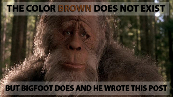
I usually follow up that introductory statement by saying, “the first thing you need to know about color is that there is no such thing as brown.” Brown does not exist. Neither does pink, or teal, or sea-foam green. These colors are not real colors, and have no place in the mind of the artist.
It’s always nice to start a class with a little melodrama. But melodramatic or not, for an artist to really understand and use color effectively, words like pink and brown have got to go. These names for colors just don’t carry enough information to be useful to the artist.
Color as a Tool
As artists, we use color as a tool to express ourselves. To use any tool to its fullest potential, we need to understand how that tool functions. Fortunately, to use a color effectively, we really only need to know three things about it. We need to know its hue, its value, and its saturation. We will look at each of these properties of color individually, but first I want to show you why we need to know these things about color in the first place.
Let’s say I want to color a realistic cherry. The first thing I need to know is, what color is a cherry? It may seem silly, but I need to be specific in order to match the color. So I’ll ask myself first, “what color is that cherry?” I’m looking for the simplest answer possible here, and the simple answer is red. That cherry is red. Now I know one of the three things I need to know to color my cherry – start with the color family red.
The next thing I need to know is how light or dark the red cherry is when viewed in even lighting with no shadows. Is it a light red, medium-light red, or dark red? Since the lighting is even, and cherries are generally fairly dark in color, I know it’s not a light red, and since there are no shadows, it’s not a dark red either, so it must be (under these conditions) a medium red. Now I know two of the three.
Finally, I’ll ask myself, “how saturated is the medium red color I’m trying to match?” In plain English, what I want to know is if the red I’m studying is a pure primary red, or if it’s been modified from its primary form, and if it’s not a pure primary red, how much less pure is it than primary red? Once I know these things about a color, I can match it perfectly every time.
Why Brown is Not a Color
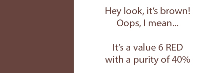
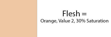
Imagine with me for a moment that you are a reclusive weirdo whose only friend is your pet cherry, “Bob”. You love your cherry friend Bob. He always listens, and never interrupts. So you commission me to make a portrait of him. Now it turns out that Bob is a weirdo too and hates to have his picture taken, so I can’t have a photo to work with, but you want the portrait to be perfect. Instead of providing a photo, you tell me that Bob is a medium-dark (value) red (hue), with a color purity (saturation) of 30%. I now know everything I need to know to get the color perfect. If you had told me that Bob is a sort of dark cherry red, I would have been lost. And that’s why brown is not a color.
Here’s what I mean. If I ask you to color a square “brown”, you really have no idea what color I’m talking about. It’s likely that the color that pops into your mind when I say brown is a different color than the one that pops into mine. Since my skull is not transparent, you cannot see the color in my head, so your chances of coloring the right brown are very low. But here’s the thing. Since I know that brown does not exist, I won’t ask you to color a brown square. Instead, I’ll ask you to color a red (hue) square, medium-dark (value 6), at 40% saturation. The resulting color looks like this:
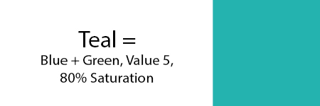
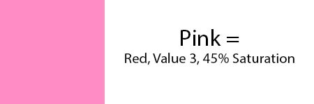
The point I’m trying to make here, is that any color name that is not a primary (red, yellow, blue) or a secondary (orange, green, purple) is not useful to the artist. Every other color name that you can think of can be better described and completely understood if it’s identified by its proper name, and by its value and saturation. Here are a few examples.

Now that we understand which words we need to use to accurately name and match any color, let’s define what those words mean.
What is Hue?
Hue is the term we use to describe the name of a particular color family. For example, red is a hue. There are only six hues in existence. They are red, yellow-red (orange), yellow, green, blue, and violet (purple). These are the colors in a rainbow.

So if it’s not in a rainbow, it’s not a real hue. Every color that is not one of these six hues is comprised of some mixture of two or more of these six hues. So when it comes to accurately naming a color, these six hues are the only names an artist should use. So throw out words like pink, chartreuse, and brown, since they aren’t at all useful to an artist who uses color.
What is Value?
The next word on our list that an artist needs to understand to use color to its fullest potential is value. Value is a measure of how light or dark any given hue is. A value scale is an arrangement of the ten major values in a line from light to dark, with the number 0 representing white, and the number 10 representing black.
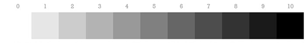
There are actually an infinite number of values between 0 and 10, but the human eye cannot distinguish them readily. So for all practical purposes, 10 values is enough.
One more thing you need to know about value scales is that the numbers often get reversed. On some scales, white is 10, and on others, it’s 0 or 1. I don’t know why this is, but I do know it’s confusing as hell.
A color value scale looks like this:
To determine the value of a color that you’re studying, imagine where it would fall on a black and white value scale. A primary red is usually around a value 5, primary yellow is a value 2, and primary blue is a value 6 or 7 if your value scale runs from white-1 to black-10. It’s important to understand that you cannot change a color value without changing its saturation, and sometimes even its hue.
And Saturation?
Of the three words we are discussing, saturation is the most confusing. Not because the concept is hard to grasp, but because the people who write the books about color use so many different words to describe this property of a color. So let me clear this up for you.
The words:
- Chroma
- Intensity
- Brightness
- Purity
All mean the same thing.
The words I like to use are saturation and purity. When I write about color, I most often use the word saturation, but when I think about color, or when I’m trying to identify a color so I can match it, I think the word purity. Honestly, purity is probably the better of the two words.
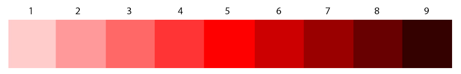
To determine a color’s purity, first imagine the most pure version of that color you can think of. For example, if I’m trying to match a red, and I’m looking to find its purity, I imagine the color of a fire truck. In my head, a fire truck is the perfect pure red. Next I look to see if the color I’m studying is different than the fire truck red in my head. If it is different, I ask how different, and in what way. I ask myself, “is the color I’m studying a duller red than a fire truck?” If it is, I know it’s a desaturated (dirty) red. Or is the color a darker red than a fire truck? If it is, I know it’s desaturated, because you can’t darken pure red with anything without making it less pure. The same is true if the color is lighter than a fire truck. You can’t lighten a pure color without diluting its purity. Pure colors only exist in their primary forms. Any deviation from prime is less pure and therefore, to some degree, desaturated.
Once you know that a color is not pure, you’ll want to know how impure or desaturated it actually is. The best way to do this is to imagine the pure color, and then mentally add gray of the SAME VALUE. It’s easiest to explain this with pictures. Let’s start with a value 5 red.
 This is as clean and pure as it gets.
Next, we’ll imagine a value 5 gray.
 In each of these squares, the values are exactly the same. So if we start adding different amounts of this gray to our red, the red won’t get darker or lighter in value, it will just get less and less pure.

So there you have it…
If you never learned anything else about color, you would still know everything you need to know to match any color you see. You simply assess the color’s hue, value, and saturation. Once you know those properties, you can match any color, even without actually seeing it. And if you can match any color that you like, any time you like, what more do you really need to know?
How helpful was this post?
1 Star: Oh man, that sucked… 5 Stars: Good God, it’s brilliant!
![]()
![]()
![]()
![]()
![]() (45 votes, average: 4.47 out of 5)
(45 votes, average: 4.47 out of 5)![]() Loading...
Loading...

This is very good thank you.
Thanks man, happy you liked it 🙂
I remember you teaching this in class, we couldn’t say the word brown!
Great information for anyone who wants to learn about color and value!
OMG I was reading and wondering what the hell you meant by saturation and not wanting to appear the “newbie” I did not ask but wow, this really makes sense and now I am looking at colors in an entirely different “saturation”
Lynda, sometimes I think those stuffy art professors use names like ‘saturation’ just to confuse the hell out of people so they themselves feel smarter. Please never feel like a newbie or be afraid to ask a question. I’ll always answer as best I can, and if I don’t know the answer, I’ll go find it for you. I’m very happy this helped! It took me a long, long time to understand saturation.
Hi, Chris–What a wonderful post! You always seem to be able to cut right through any superfluous BS, and get to the heart of what is most important for us to know. About the value scales being “reversed,” in the Munsell system, value 1 represents 10% of light, value 5 represents 50% light, and so on, up to value 9 being 90% light, so you have 9 values plus black and white. From what I’ve learned, the reverse scale wasn’t really new, but came to the fore when Helen VanWyk (an excellent artist and host, with a great personality) was the TV painter financed by a paint company that put the white first because they wanted to be different than most of the others. At least, that’s the story I’ve been told. It certainly confused things for people, didn’t it? I’m sure there are many other stories about this subject. Anyway, I’m so glad I found you and your blog–you do such an exceptional job at explaining things in straightforward terms that we can all understand. Thank you–I have learned so much already!
Hi Marsha – What a kind comment, thank you very much! I really appreciate it. I think a lot of times the language and terminology used serves as a sort of barrier to entry for a lot of new artists. I understand its purpose in academic circles, but to be frank, it’s relatively useless when it comes to actually learning the concepts. Thank you for the story about VanWyk. I hadn’t heard that one before. It is a bit confusing, but with all respect to Munsell, I like the reverse system better. It makes more sense to me as it represents actual mixing percentages. Super happy to have you here. Sounds like you know your stuff!
I looked at the making the original syle post and I’m looking at this. I mostly draw cats and a lot of my cats that I use are browns. I don’t know how to describe the browns the way you say to and I want to use bright colors in my images but I don’t know how. I usually do digital art like on my phone.
Hi Moth, thanks for the comment. Would love to see some of your work so I can get a better idea of what you do. Can you please post some examples?
BROWN IS A COLOR!!!!!!!
Hi Christopher! Well I hit the color jackpot when I stumbled upon your articles. What a clear way of explaining color. I majored in art ed in college and had one of those teachers that seemed to want to make it more difficult than it had to be to make themselves look smart. So I never really learned to understand color. I do not have an innate sense of color as some seem to but I always wanted to understand it. You have cleared up the basics for me and that is a great place to start. I do have one question though….. I thought that to make a color darker you use its complimentary color. But here you are using gray. Could you explain? Thanks.