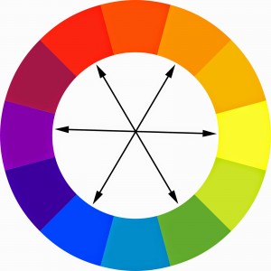
In the traditional model of color theory, complementary colors are colors that lie opposite each other on the color wheel. When most people think of compliments, they generally think of them as they relate to the primary colors – for example, since red is directly opposite of green on the color wheel, red and green are complementary. The same is true of blue and orange, and yellow and purple.
The reason complementary color schemes can be used to great advantage in a drawing is because all three primary colors are present in complementary combinations. In any basic complementary pairing, you have a dominant primary color and a subordinate secondary color composed of the other two primary colors. Since orange is a mixture of yellow and red, when used in a complementary combination with blue, all three primary colors are represented, which theoretically should be pleasing to the eye. Unfortunately, in actual practice complementary colors are often super ugly together.

If you’ve ever tried to use complementary colors together in your drawings, you probably figured out pretty quick that placing a primary yellow next to a secondary purple results in a garish, clashing color combination. The colors seem to compete with one another rather than complement each other. And while complementaries may be a good color combination for a high school football team, they really don’t work that well in a drawing in their pure unmodified form.
Any time you place two complimentary and relatively pure colors next to each other you create visual conflict. Since the two colors have similar color strengths and are polar opposites in every other way they compete with each other for visual attention and end up looking discordant.
The secret to using complementary colors effectively is to clearly make one color more dominant than the other. There are several ways to do this. The first is dominance by proportion – for example, when using complementary colors, making one color occupy a larger area of the drawing and reserving the other color for a much smaller area will create balance between the color strengths and provide a pleasing result – but using complementary colors in relative proportion to one another creates a statically fixed image. Since each color stands unmodified in its purity, the image tends to lack movement and excitement.
Complementary Color Combinations in Realism
When it comes to more realistic styles of drawing or any drawings where you want your colors to look more natural, a different approach is required. The best way to use complementary color combinations in a more realistic work is to balance the saturation or purity of the colors. Fortunately, Copic makes this easy to do. If you remember how to read the numbers on a Copic cap, you’ll know that the first number on the cap represents the color strength, or saturation of the color, with low numbers like zero or one being very pure, and high numbers between five and ten being successively less pure. We can use this knowledge to our advantage when coloring with compliments to ensure our combinations work well together.

Let’s take a look at a specific example using purple and yellow. In the first tutorial on how to color skin with Copic markers, I laid in a base color for her skin with an E50. If you remember, I mentioned at the time that E50 is a cool light flesh color that leans toward the yellow side of the color spectrum. The number five on the cap indicates that the color is fairly dull and not very pure. So for her face I used a dull, light value yellow.
When coloring the base layer for her hair, I used a BV00. As the cap indicates, this color is a very pure, light value purple. The color strength of the BV00 is much stronger than the color strength of the E50 since the first numbers are so far apart, but since the last numbers are the same, the value of the two colors is pretty much the same.
So in her face and hair I used a complementary color combination where the two colors used were the same degree of light and dark, but different degrees of color strength and purity. The dull yellow makes the more pure purple look more vibrant, while the purple BV00, which in this instance is cool compared to the skin color, makes the yellow-ish E50 look a little bit warmer. They actually complement each other!
The cool thing about this approach is it sets up the opportunity to create other complementary color pairings in the same drawing. For example, I established my base colors for her face and hair with complementary yellow and purple. I then added blues to her face to help cool and round the form. But when I surrounded the dull yellow of her face with much purer purple in her hair, the E50 looks a little warmer and a little more orange-ish, which is the complement to the blue I used to cool and round her face.
So now in addition to the hierarchy of focal points I developed in part 2 of the skin coloring series, I also have a hierarchy of complementary colors – predominately yellow skin against purple hair as my primary compliment, and slightly orange-ish looking areas of skin against much purer blue areas as my secondary complementary pair.
I complete my complementary trifecta by using pinks and reds in her lips and cheeks, and greens in the irises of her eyes. So by the time I’m done, I have all three of the basic complimentary pairs in the same drawing and all located in the face and hair!
So now that you know how to use complementary colors, the next time you grab an E00 (Orange) marker to color your skin colors, look for areas to add a little B000. Your drawings will thank you.
If you would like to receive personal feedback on any work you’ve created using the methods I’ve explained here, you can upload your image in the comment section below, or if you have any questions or comments, please feel free to leave a reply!
How helpful was this post?
1 Star: Oh man, that sucked… 5 Stars: Good God, it’s brilliant!
![]()
![]()
![]()
![]()
![]() (51 votes, average: 4.20 out of 5)
(51 votes, average: 4.20 out of 5)![]() Loading...
Loading...

I appreciate your tips! Thanks!
Thank you! Would love to see how you are using them in your own work!
Pingback: Colour. – Caoimhe's Graphic Design Class Blog
Thank you very much! I learned plenty about complimentary colors and complementary colors!
wow this was so helpful!!! thx!!
I didn’t learn a lot about this but thanks anyway ?
poopy
Thanks your awesome , Im going to try this in my resin pieces1