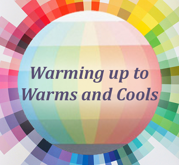
When preparing for this post, I decided to do a quick search on warm-cool color contrasts. What I found was disheartening and confirmed my suspicions. There really isn’t a lot of good information out there. Nearly every site I found that made mention of warm-cool color contrasts used the most simple model possible. You know, the one that states that red, orange, and yellow are the colors of the sun and are therefore warm, while blue, green, and purple are the colors of water and… well… I guess purple cold things. Um……maybe frozen eggplants??
In the simplest terms, the above statement is true. Reds, yellows, and oranges are warm colors, and blues, greens, and purples are cool. But simple seldom equals accurate.
Warms and Cools are Relative
The more complicated truth is that warms and cools are relative. What this means is nearly any color can appear warm or cool depending on the colors you surround it with. Don’t believe me? Good… Let me show you.
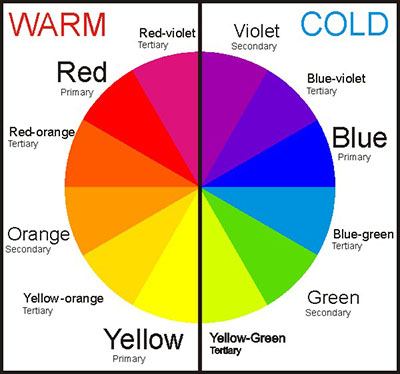
If you look up a warm-cool color wheel, you’ll find a line drawn through it separating the reds, oranges, and yellows from the blues, greens, and purples. At first glance this seems easy to accept. But let’s take some colors from the wheel and examine them more closely.
Let’s take that green that sits on the cool side of the line. When viewed in context on the color wheel, it is clearly a cool color. But remember, it’s only cool in a certain context. If we take the same green and surround it with a fully saturated violet from the color wheel, we get a surprisingly warm green.
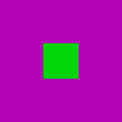
Because violet is intrinsically cooler than green, the green now clearly appears to be a warm color. You can do this with almost any color you like. Let’s do it again, but use red as our test color. First, let’s surround it with a blue, and then with a green.
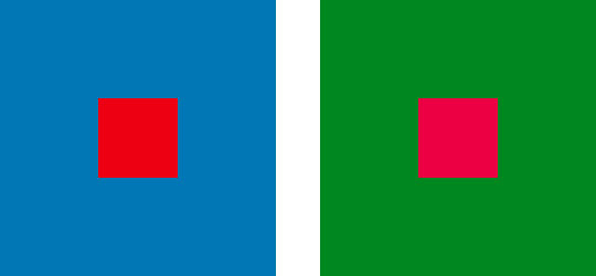
Compare them side by side and it’s clear that one red is cooler than the other. In this context, red, which is almost universally considered warm, changes its character and gives itself over to the dark side (or cool side for you non Star Wars fans.)
Let’s do one more. We will use a cyan blue. For me, there is no way that I can think of cyan as anything other than a very warm blue. I know, I know, blues are cool colors, but take a look at the test below. Is that blue really a cool? I don’t think so!
Finally, let’s take one more look at that red. In this test we will run out six squares of red, side by side. In the color wheel above, red sits squarely on the warm side of the line. In fact, I doubt very many people at all ever question the idea that red is a quintessential warm color. But…..is it?

As you can see, the red on left is obviously warm and the red on the right is obviously cool, especially in comparison to the first red in the sequence. This test proves beyond reasonable doubt that red can be, and in fact is both a warm and a cool!
Admittedly in this test the red gets a little darker as it gets cooler, but don’t let the value change fool you. Technically, almost any time you darken a color or reach for a darker marker of a color, the hue gets cooler. You can darken a red in one of two ways without changing its hue or “color identity.” You can use black to darken it, but since black is really a very, very dark blue, it darkens and cools the red. You could also add purple to red to darken it but still keep it looking like red, but since purple is always cooler than red, it too darkens and cools the color.
So what’s the deal?
The deal is nearly everything we accept as true is only true in a certain context. Especially when it comes to art. Let me give you a non-art example:
A polar bear is white – unless you put it in a perfectly white room. The same principle is true with temperature. When it’s 100°F outside, it’s hot, but if you compare that to the average daily temperature on Venus, which is 864°F, 100°F feels positively chilly. (Bet you thought mercury was the hottest planet in our solar system – nope, it’s Venus.)
But I digress. When it comes to color and art, the concept of color relativity can play an important part in elevating our work to a higher standard. By manipulating cool colors to be warm and vice versa, we can fool our viewers into seeing colors in a way they’ve never seen them before. They may not know why your work appears to have more beautiful color than the next artist out there, but they will know that it does. And that will set you apart from the crowd.
If you would like to receive personal feedback on any work you’ve created using the methods I’ve explained here, you can upload your image in the comment section below, or if you have any questions or comments, please feel free to leave a reply!
How helpful was this post?
1 Star: Oh man, that sucked… 5 Stars: Good God, it’s brilliant!
![]()
![]()
![]()
![]()
![]() (11 votes, average: 4.36 out of 5)
(11 votes, average: 4.36 out of 5)![]() Loading...
Loading...

Thanks so much for this tutorial and for being so forthcoming with your methods, i found that the tutorials have really helped open my eyes to what is possible when these markers are used correctly! Looking forward to developing it all further and seeing what comes out of this. Your blog is a huge help, and quite eye opening. Really great, and helpful page.
Many thanks!! 🙂
This is sooooo cool! Nice use of warms and cools, LOVE the purple, the blue in the background seriously makes the orange in the eyes pop! Super nice gradations in the “E” colors as well! I can’t wait to see more!
Great post, Christopher!
It reminds me of when I took Charles Emerson’s ‘Understanding Color’ class.
The short version-
Charles had a mantra:
“Color is color only, according to:
*Amount,
*Placement, and
*Application. ”
What that means is exactly what you are saying here. A color is a color…. until you put another color next to it. Then, the two colors begin interacting with each other.
Where you place a color, how much color you put down, the colors you surround it with, and how you apply the color all affect the final appearance of that color.
That’s (part of) what makes art so exciting!
I’m so impressed with you 🙂