Hi guys, Christopher Kerry here, and today I have a real treat for you.
In March 2016 I had the honor of being a featured speaker at the Starfest Convention in Denver, Colorado, where I gave a live Copic demonstration and a talk on how to make a living as an artist.
It was awesome.
Not only were my demonstration and talk well attended, but I got to meet some amazing artists as well. One of those artists was Jason Meents. Jason is an expert at drawing super cute, super amazing tiny tot style fan art like this –
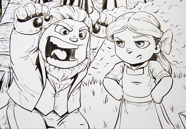
Awesome, right?
This particular drawing he did as a commission at the Con, and when I saw him working on it, I have to admit that the first thought that crossed my mind was, “man that’s great, I would color the hell out of that!” Well guess what? The guy who bought this piece contacted me and commissioned me to do just that. (Thanks Josh!)
As you may know, I make my living drawing and coloring my own original art. It’s really unusual to get to color someone else’s drawings. But I gotta tell ya, I love it when something like this comes across the drawing table.
So kick back and enjoy, because I’m going to show you how to color up some amazing fan art. By the way, if you’re not familiar with Jason’s work, you should do yourself the favor and check out his Facebook page. You’re gonna like what you see!
Step by Step Coloring Process
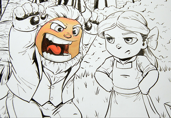
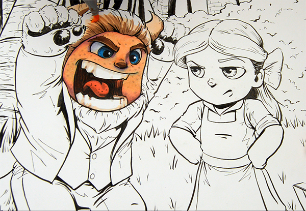
For this tutorial, I’m going to be coloring the Beast’s head. I was tempted to start with Belle, but the Beast just looked like so much fun that I couldn’t resist.
By the way, for those of you who are following along but don’t have many or any Copics to follow along with, I’ve got an awesome Copic to Spectrum Noir, Prismacolor Marker, and Prismacolor Colored Pencil color conversion chart!
Get The Conversion Chart!
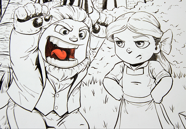
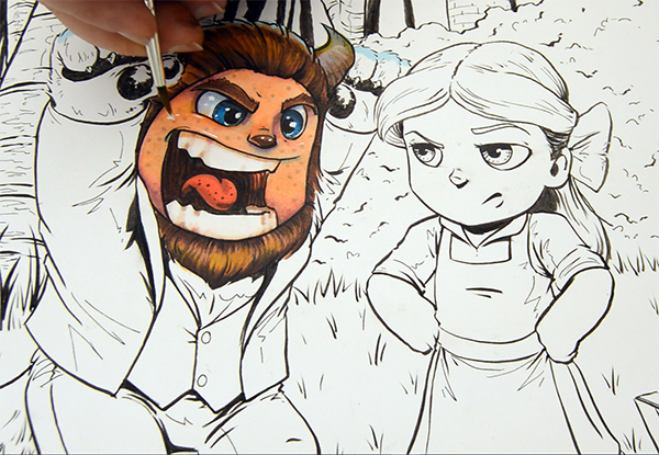
I decided to start with his mouth, since it seems to dominate his face.
So much rawr.
I lay in my base color, R17, over the black ink work in a flat wash. Coloring over black like this is an easy way to get subtle color effects with a single marker. I add a little E07 to the underside of the tongue to give it some form, and help it look three-dimensional.
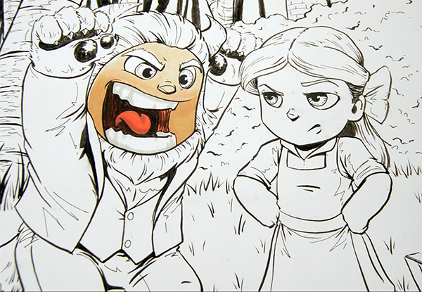
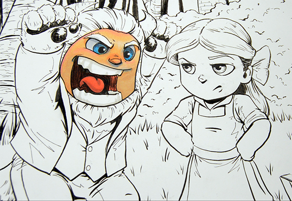
Here I begin to lay in the base colors for his face. I decided to go a more traditional route, so I’m using E33, E13, and E11 to start. I almost never use a ‘three E’ color combo in skin, but for this it was a perfect choice.
I lay the colors in broad, flat washes, not paying too much attention to the blend, just trying to get them in basically the right spot.
Now it’s time to add some life to those fairly dull E base colors. I’ve added RV13 and R32 at the hairline and on the cheeks and nose. Notice how I make no effort to lay these in smoothly, or even carefully. I just out them in heavy where I want them to be.
Important note: A lot of people think that you need to work quickly with alcohol markers to get a good blend. This is simply not true. You can blend dry markers at almost any stage of a drawing – just layer over it with your base color and you’ll get the blend you want.
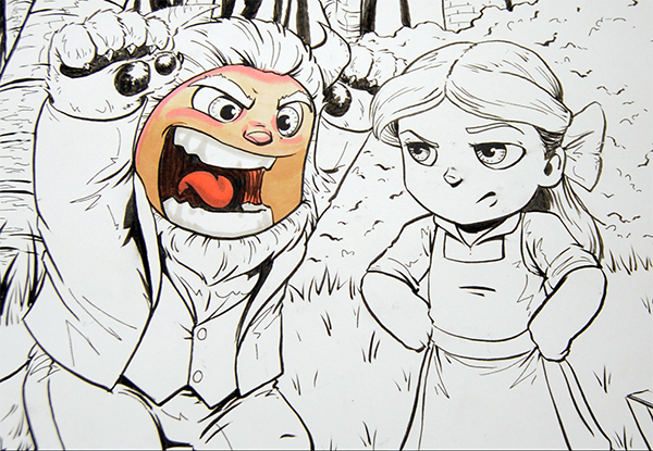
See? All blended. No worries. I just scrub over the color with the E11 until it looks nice and smooth.
Notice that I’m not using a colorless blender here. The colorless blender is awesome, but blending colors like this is not what it’s best at.
At this stage I’m starting to establish my focal point. I want the viewer to look into his eyes, so I have to make sure they command more attention than his great, roaring mouth. To accomplish this, I’ll use my brightest color, B05, in his irises.
 I then surround his eyes with dark accents. I’ve used E97, E29, and E49 in the eyebrows and nose, and for the shadows around his eyeballs.
I’ve also added some strong darks to the bottom of his face. Since he’s a beast, I want his skin tones to be strong and relatively dark, especially compared to the lighter, purer colors I will eventually use for Belle. The colors I’ve used here are E25 and V06.
Important note: Anytime you want to make a part of your drawing stand out and nearly impossible to look away from, place your lightest lights, you darkest darks, and your purest colors in that area. The contrast of bright color, dark darks, and light lights creates the full spectrum of contrast and ensure that the person who is looking at your art will look exactly in that spot.
You can use super strong color like this in all your flesh tones, beauty or beast. In fact, you should. You just have to blend them into the surrounding base colors.
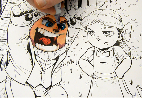
Here I blend and soften the V06 with an R32, and then YR00. Easy peasy, and it really adds life to the drawing. I also use the YR00 to lay in the base colors for the horns and the highlights in the hair. It just makes sense to use the same color in as many places as possible. Doing this helps keep the overall color scheme in harmony.
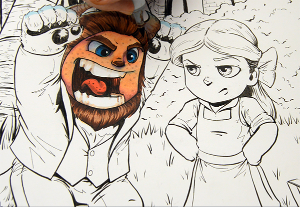
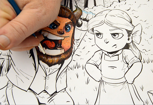
Important: Ok guys, this ones a biggie. I want you to take a look at the nib of my marker in this photo. See how far it’s bent over? Kind of looks like the end of a paint brush, huh? That nib is called a brush nib for a reason, and you should be using it like a brush.
Look how much pressure I’m using. I’m not all up on the tip like a dainty ballerina on tip toe. Nope. I’m putting a ton of pressure on that thing.
Guys, these markers are awesome AND durable. Don’t be afraid to use them and use them hard. They will do whatever you make them do, but you’ve got to make them do it. As soon as you realize that YOU control the markers and not the other way around, your results will dramatically improve.
So go on and out some pressure on ’em. Scrub them on the paper. Make them do what you want them to.
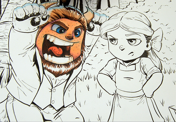
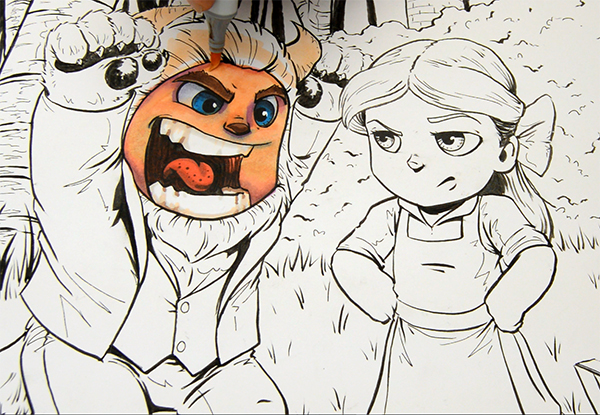
In this step, I’m beginning to address the hair. I’m using the same E colors as I used for shadow accents in the face – E49, E29, E25, and E97. My goal here is to not only make the hair look like hair, but also to frame the face with a darker color. Remember what we talked about a few steps ago? I’m using the same idea here.
I want the viewers eye to be drawn to his face as a whole, and his eyes in particular. By framing his face with dark hair, I’m using the contrast principle of strong darks juxtaposed with light lights to create a focal point. Since I’m not using bright color as well, the eyes still dominate, but my viewer’s attention will be drawn to the entire head, and then focus on the eyes. So the whole head becomes the secondary focal point to support the primary focal point of the eyes.
In this step, I’m scrubbing in a layer of E97 over all the hair colors. Notice I said scrubbing. Again, I’m using a lot of pressure. I want the E97 to not only act as a highlight color, but also as a blender. So I use firm pressure as I lay this color over all the other hair colors to make sure I get the blend I want.
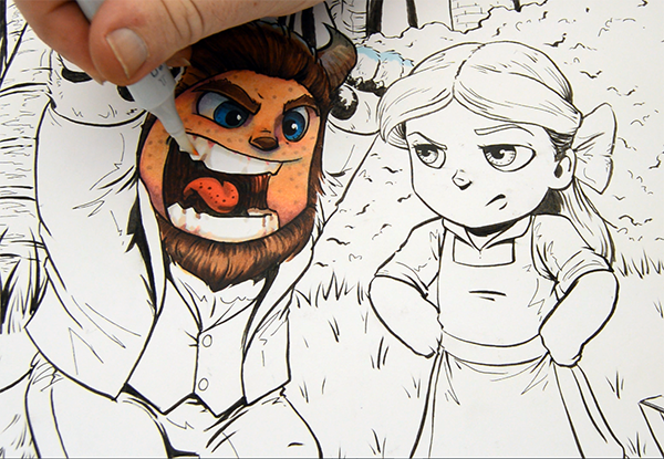
Here I’m using the colorless blender to soften the marks I’ve made in the teeth area. I love the colorless blender for blending colors into the white of the paper, and for lifting color to create texture. It’s a great tool for both of those jobs.
In this step, I’m adding white highlights. The white I use is M. Graham’s Titanium White Gouache. It’s opaque and goes on with a brush, and it’s perfect for adding highlights to Copics.
Ok guys, here’s a secret tip – In addition to being a nice, strong white for highlights, the white I use is also removable or changeable after it’s dry. If you make a mistake with it, you can remove it completely with a little bit of water and a paper towel.
Just dip your brush in clean water and dab back into the area you want to remove to re-wet it. Then pick up the water and the white with a paper towel wrapped around your finger. You can also create amazing, soft highlights by wetting and spreading the white. Watch this part of the video carefully to learn exactly how to do it. It’s a really versatile technique that I know you’re gonna love.
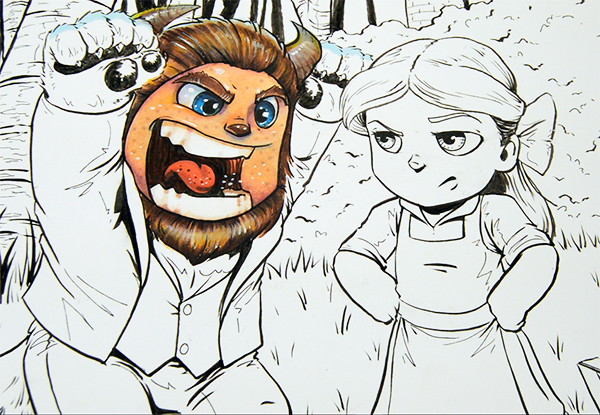
And done! …with his face at least. It took me just slightly under an hour to color this.
The complete list of colors I used, as well as a color conversion chart for Copics to Spectrum Noir, Prismacolor Premier Markers, and Prismacolor Premier Colored Pencils can be found by clicking the button below!
Get The Conversion Chart!
Oh, and one more thing…
It was really a treat for me to get the opportunity to color this piece. A huge shout out to Jason Meents and Josh El Beardo for giving me permission to share this tutorial with you. You guys rock.
How helpful was this tutorial?
1 Star: Oh man, that sucked… 5 Stars: Good God, it’s brilliant!
![]()
![]()
![]()
![]()
![]() (43 votes, average: 4.67 out of 5)
(43 votes, average: 4.67 out of 5)![]() Loading...
Loading...

Awesome! Can’t wait until I have more colours to try all these techniques with.
Hi my name is paul. I use alot of diffrent pens mostly prismacolor but alot of sharpie’s as well. Use what you like and enjoy your colors! If you respnd ill show you what im wrkig on. Have a nice day ?
Thank you, Amy 🙂 The way I built my collection was to buy 2 markers with every paycheck. You’d be surprised how quickly they build up that way!
I really enjoyed your tutorial heaps!! I draw my own designs as well as pics then later colour them in with coloured pencils various brands, have used markers, crayons, craypase pastels, textas, trying different textures. Keep up your great creative talent. Have a great day!! Cheers!! ??
Thank you, Jo-Anne. Any interest in seeing a colored pencil tutorial from me?
I would be interested in a color pencil tutorial.
Hi Dana, your wish is my command 🙂 Be sure to check out this week’s tutorial!
beautiful, awesome and all that jazz. i enjoy your tutorials very much.
Thank you, and all that jazz 🙂
Super! Love how they work!
Hope I win that whole set of Copics!!!! Fingers crossed!!
Good luck! 🙂
The conversion chart is awesome! Thank you so much for sharing it with us. I have friends who use those other brands and will benefit from this chart as well. We make stamped greeting cards and use our colors all the time to finish them.
Thank you, Ruth. I’m glad you liked it! I’d love to hear more about what you do, and if there are any specific techniques I could cover to help you 🙂
Wow.thats awesome. O,my, I love to win that Copicsset.
Gr, Elly
Thank you, good luck! 🙂
Very fun to watch you work and read your step by steps too Christopher. Seems to me like you are very much deserving of the honor to color Jason’s drawings. 🙂 Thanks bunches for sharing. j.
Thank you!
Thank you for your generous spirit! I really enjoy learning tips from an artist- especially one who is so gifted. Thanks for the conversion chart! I have Spectrum Noirs and Prismacolor pencils, but have not afforded any Copics yet…
Blessings to you!
Hi Rebecca, thank you for the kind compliment. I’m glad you liked the conversion chart! I would love to see how you apply these techniques with the markers and pencils that you have 🙂
Wow! That was awesome. Thanks for the tutorial.
Thanks, Elizabeth. You’re welcome 🙂
That was interesting! So… colourless blenders? I have a drawing that I was working on after your Grisaille tutorial and the skin of the girls is pretty streaky. Would colourless blender help to even it out? It doesn’t matter too much if I wreck the drawing. It’s been scanned and I can always photoshop the image if I want to keep it.
Hi Cindy, would you do me the favor of uploading the image you are referring to here? I kinda need to see it to give you the best advice I can. 🙂
Okay, thank you very much. The drawing is roughly 19cm x 15cm.
Hi Cindy, in this drawing I would not suggest using the colorless blender to try and even it out. Instead, I would recommend applying at least 3 or 4 more layers of ink. The more layers you have, the smoother your colors will be. Hope this helps 🙂
Thank you very much for your reply Christopher. I will give that a try with the three or four more layers of ink and see how it goes.
Will you be coloring the rest of the picture? Have been waiting for video 2. As always totally enjoy your video’s
Lynda
Thank you Linda, I will be coloring the rest of the picture, though I’m not certain I will be doing further tutorials on it. I’ll let you know when I figure it out 🙂
First of all, thank you for the conversion chart. I have a bare minimum of Copics, but got exceptionally lucky and got 3 sets of 24 of Spectrum Noir for Christmas (gotta love great sales and family that pay attention lol). The conversion chart is going to be one of my best tools for your videos.
And secondly, thank you for the video. It’s wonderful to have someone teaching the little techniques that so many other tutorials forget to mention. Very much appreciated 🙂
You’re very welcome, happy you liked it 🙂
Christopher, thank you so much for the conversion chart and tutorial!
You’re very welcome!
This tutorial and the charts are incredibly helpful. By chance, are there plans to ever release a more extensive color conversion chart between the marker brands?
This tutorial was very interesting. I make greeting cards so there’s not a lot of coloring but I still want them to look good. I do struggle with the copics. I think my two biggest issues are the paper I’m using. Which paper do u suggest? And number 2 overworking the colored area. I am never satisfied and keep adding light then dark then back again. I am really looking forward to watching more of your tutorials. Thanks for making this information available.