Marker Techniques for Colored Pencils
I am so excited about today’s tutorial! Seriously, this may be the best tutorial I’ve done today!
It’s no secret that I love my Copic markers. I honestly believe that Copics are the most versatile medium I’ve ever used. But they are expensive, and I know a lot of the 40,000+ readers of this blog don’t have enough Copic markers to follow along with my tutorials. I’m sure some of you don’t have any at all.
But no worries, I’m going to show you how to get around that today.
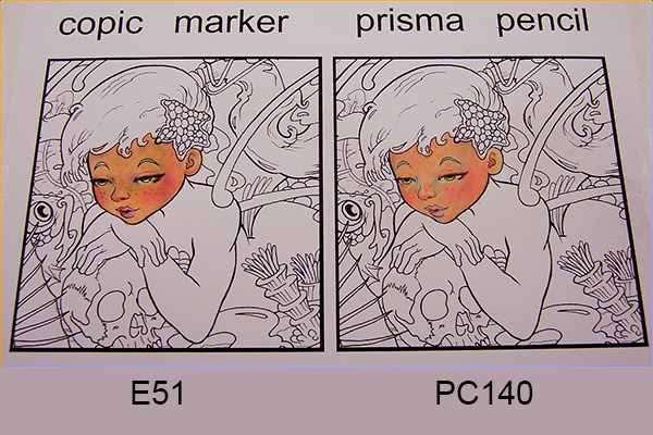
Today I’m going to show you step by step how to use the same exact techniques I use with Copics, but with Prismacolor colored pencils. So if you’re one of the thousands of readers of this blog who uses colored pencils more often than Copic markers, this post is for you.
Before we get started, let me explain how this tutorial is set up.
On the left hand side, I’ll be showing you each step I do with Copic markers. On the right hand side, I’ll do exactly the same step, but I’ll be using Prismacolor colored pencils instead of Copics.
Got it? Good.
Ready, set ….wait a minute. First, let’s get a few misconceptions out of the way.
These are the top three myths people believe about using colored pencils:
Myth #1 – You can’t use colored pencils the same way you use copic markers.
FACT – Yes you can. You can follow my Copic tutorials step by step with colored pencils and get nearly the same results.
Myth #2 – You can’t use tons of layers with colored pencils.
FACT – Yes you can. While it is true that there is a limit to the amount of layers that you can use with colored pencils, the same thing is true when using Copic markers. With pencils, the secret is to use light pressure for most of your layers. Don’t worry about coverage or blending in your first layers, just get the colors in there. In the final layers you’ll use heavy pressure to get full coverage and blend.
Myth #3 – You can’t use a white highlighter over wax pencils.
FACT – Yes you can. Seriously.
Ok, let’s get to the damn tutorial already.
How To Use My Marker Tutorials When Coloring With Colored Pencils
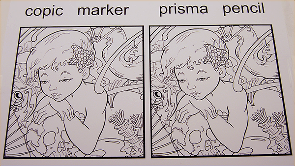
The drawing I’ll be using for this tutorial is a section of one of the drawings from my new Color Academy Ink classes. We will be talking about the Academy a bit more very soon. But for now, just keep in mind that nearly every tutorial on this website, and every Academy class can be followed step by step, even if you’re using colored pencils instead of markers.
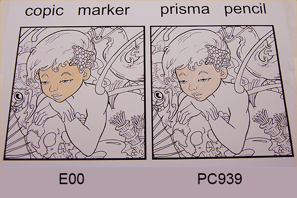
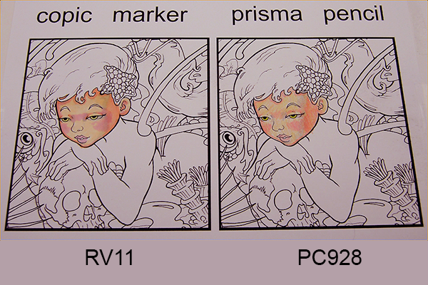
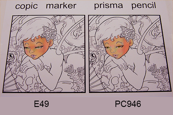
First, I lay in my base tone. I’m not worried about putting in a smooth, even tone at this stage, I just want to lay the foundation for subsequent color layers. On the Prismacolor side, I’m using very light pressure on the pencil.
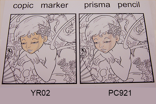
Next I separate the front of the face from the side of the head with a warm gray. If you look closely, you’ll often see a slight shadow like this when a form changes direction. In art-speak, it’s called a terminator line.
I add a warm color to the sides of the head, the tops of the eyelids, and under the hairline. The colors in her face are relatively cool, and a good rule of thumb is if your light areas are cool, your shadows and reflected lights will be warm, and vice versa.
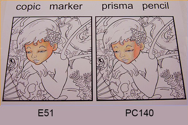
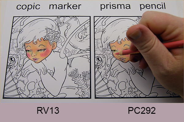
I add pinks to the cheeks and lip, and across the bridge of the nose. I also add a complementary green to the irises. In both the Copic and Prismacolor pencil examples, notice how roughly the color is layed in. It’s a mistake to try and blend too early, so leave them rough at this stage.
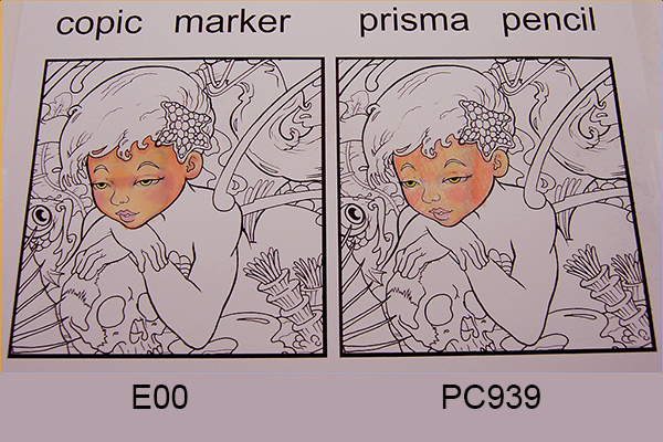
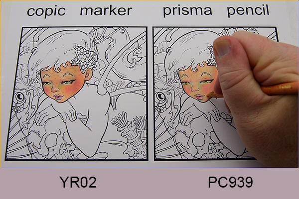
I use a slightly yellowish color overall as a blending layer.
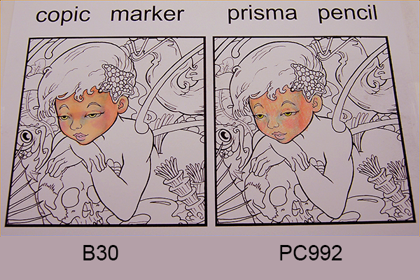
I add a cool blue anywhere I want the form to round away from a high spot. The sides of the nose, corners of the eye sockets, and under the bottom lip are all good places for this color.
Another blending layer over everything. You can see the colors are starting to smooth out now.
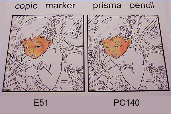
I accentuate the lash line and color in the opening of her mouth with a dark brown. The interior of an open mouth should never be colored black. Instead, use a warm, dark color in this area.
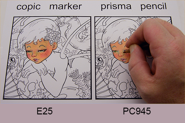
I strengthen the blush in her cheeks. The pink I’m using here is fairly intense, but I’ll knock it down with subsequent blending layers.
I add texture dots to break up any large, even areas of color and to add interest to the skin.

Another blending layer to pull it all together.
I add freckles. Mostly just because they’re sexy.
One more blending layer to soften everything out, and the coloring process is complete.
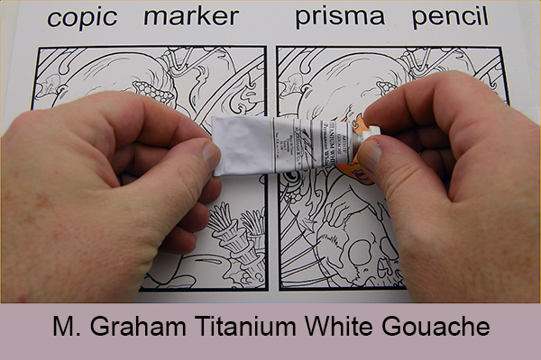
To add highlights, I’ll be using M. Graham’s Titanium White Gouache.
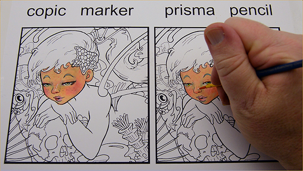
I place these highlights with a brush, and place them wherever I think they will accentuate the overall look of the drawing. I’m not overly concerned with trying to make these highlights match any particular light source. My only goal here is to enhance the drawing, not indicate the direction of the light.
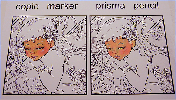
As you can see, the two drawings look remarkably similar regardless of which medium I used. The reason for that is simple. What I teach in my tutorials, and to a greater extent in my new Academy classes, are not just tips and tricks.
They are fundamental art principles.
What are art principles? I’m glad you asked. Art principles are foundational ideas that are universal to every medium. They are the why, not just the how. Let’s face it, the “how-to’s” of coloring anything are really pretty simple. Let me show you what I mean –
How to color with markers:
Uh…. take the cap off, put the tip on the paper, and move your damn hand back and forth.
That’s the how-to. The why-to is what’s really important.
Why use cools on the side of the nose? To make the sides round away from the bridge. See? That’s the important thing to know.
So there you have it. Proof positive that:
- You CAN use colored pencils step by step with nearly all of the Copic tutorials on this site.
- You CAN use tons of layers with both Copics and colored pencils.
- You CAN use white gouache to highlight colored pencil drawings.
Oh, and one more thing…
You can click here to get a practice page of this drawing to try out the techniques you just learned!
How helpful was this tutorial?
1 Star: Oh man, that sucked… 5 Stars: Good God, it’s brilliant!
![]()
![]()
![]()
![]()
![]() (259 votes, average: 4.65 out of 5)
(259 votes, average: 4.65 out of 5)![]() Loading...
Loading...

awesome..sharing on FB
Thank you Bev, I’m glad you liked it! And thanks for sharing, you’re awesome!
Wow–I never would have thought.
Lol pretty cool, right?
Christopher – this is awesome! Thank you for this tutorial. Now, question – my daughter has the Prismacolor alcohol markers, as well as the pencils. I’m wondering if the Prismacolor markers are as good as Copics?
Hi Terri, thank you for the compliment! I’ve used Prismacolor markers fairly extensively, and they are a good quality marker. I don’t like them nearly as much as I like my Copics, they just don’t seem to lay down color as evenly or blend quite as well. Having said that though, they are without a doubt better quality than any other alcohol marker alternative to Copics. She should be fine with them 🙂
I used pencils with the techniques of the Copic markers all the time!
Harry Potter magical creatures is just an example!
Thank you for sharing, Hannah! This is awesome 🙂 I happy to learn that you were already using this approach.
You are welcome! I can’t wait to use that approach in my doctor who book!
Oh these aren’t prismacolor pencils either! They are crayola
I discovered gouache recently and I love it! I would love to see your take on a gouache tutorial! I’m used to watercolors and acrylics, gouache has a bit of a learning curve for me.
Hi Deirdre, unfortunately a gouache tutorial would be a little outside the norm for this site, but I’d love to see the work that you’re doing! Feel free to post it up here 🙂
I WILL definitely be trying this technique!!!!!
YOU WIN!
Oh yeeaahh, I’m the winner 🙂 be sure to show us what you do with this technique here!
Awesome, thanks for sharing. ?
You’re welcome, thanks for the comment 🙂
I’m completely in awww.This is an AMAZING Tutorial. Thank you for doing this.Your a Fantastic teacher.
Thank you Valerie. I’m very happy you liked it. And thank you for the kind compliment! I really appreciate it 🙂
You nailed that challenge. Please tell me about “white gouache.” I have no clue what this is or how to apply it, but like the idea of the white highlights! Thanks for sharing very much! My “Mom’s Day gift!”
Nailed it, ooh yeaah 🙂 Thank you Rebecca, we have an entire post on which whites work best with Copics, and you can find that here:
https://copicmarkertutorials.com/use-white-to-highlight-your-copic-drawings/
Let me know if you still have questions 🙂
What a great tutorial! I am excited for the new academy classes!
Thank you Unky, I’m very excited about the Academy too! I can’t wait to share it with you guys 🙂
That was an awesome tutorial! I’ve used prismacolors for 26 years. My mother who was an outstanding watercolorist told me not to use anything else when I first started doing art. I had more control with pencils than the watercolor I eventually used. I know that you are teaching principles which is extremely helpful to those of us who never actually took art classes..
Thank you, Laura. In each of these posts I do my best to at least touch on a larger core concept, so I’m happy you’re finding them useful! Would love to see some of your colored pencil work in particular. Please feel free to post it up here 🙂
I am obviously going to have to pay closer attention to your tutorials…lol
I actually prefer coloured pencils to any other medium I’ve tried (so far)…and I’m poor…so that has to factor in….I don’t even have prismas…I have Crayola (60 pack) and Faber-Castell (artist…56…it was a 60 pack but 4 were missing…it was an awesome find at a local thrift shop).
I’ve looked at a couple of your tutorials and was like “I will never be able to afford Copics”…but…you’ve just proved (See..I’m getting to the whole bet thing) that you can achieve the same effect with a coloured pencil! 😀
Thank you Mary, what an awesome comment! This was my first time using any type of colored pencil, so I’ve never tried Crayolas, but I’ll pick some up and see what I can do with them, that way if you need help I can address your needs specifically 🙂
You are an Amazing, Talented Artist and am so excited to learn techniques as I am brand new to coloring and looks like I’m learning from the BEST! Thanks for Sharing!
Good god you’re making me blush! Thank you for the kindness, I’m super happy to have you here, and I promise if you follow along you’ll know more than most in no time at all 🙂
Absolutely amazing colors, that i would never put together. Thank you for the tutorial.
Question : What kind of paper did you use?
Nataliya
Hi Nataliya, thank you for the compliment! I love using color this way, it’s amazing what you can get away with when you keep the values the same 🙂 The paper I use for my commissioned Copic drawings and for this tutorial is Strathmore 100 lb. Smooth Bristol Board. It’s awesome paper, though to be honest, I’ll color on anything that will stand still long enough. I actually really love using Copics on cheap sketchbook paper 🙂
I love it, followed along and I did it. I only have one Copic marker so far. Going to buy one at a time as affording allows.
That’s an awesome strategy, Sandra. When I first started collecting them, I would spend a little over $15 per paycheck and pick up three new markers. Keep doing it that way 🙂 Would love to see the result of your drawing with this post, will you post it up here please? 🙂
Yes I can do that.
Thank you for sharing this, Sandra! It’s awesome! If I hadn’t known better, I would have sworn it was Copics! 🙂
Hiya Christopher,
Well down under we use Derwints but I think after watching that tutorial that it would not matter if you used powered mud you would end up making something good. I thank you for your ability to show your talent that makes me want to draw. I have gotten myself 12 copic’s: 4 basic colours, 4 skin tones, 2 warm greys and 2 neutrals and have managed to get some very decent pictures even if I do say so myself and will continue to watch your tutorials for my inspiration. Thank you again
oops Derwents, typical typonese from me
Hi Lynda, it sounds like you have a really good basic starter set. 🙂 Would love to see some of your Copic work, especially if you’re using the limited palette you’ve described. I actually love using a limited palette. It forces creative solutions!
this is my first attempt at skin, I had never coloured skin before, I used some normal markers for the togas
Hi Lynda, thanks for sharing. I love how smooth and even the flesh tones are, and the sense of three-dimensional volume you’re beginning to achieve. Would love to see you push it further using some of the purer colors that you have as an under-layer much like I do in the dark skin tones tutorial. These are good, but you’d be surprised how much adding just a touch of color that you normally wouldn’t think belongs to skin will do. 🙂
this is my second attempt with just the 12 markers from copic and their book level 3 colouring guide
What are your other colors besides the four skin tones and the four grays? This is nice, but I’d love to see you use every color you have in the skin, even if you don’t think they belong! Can you please list the names of the markers that you have?
Honestly, I prefer the colored pencil one you did over the Copics! Great tutorial…Thanks!
Loved this tutorial! 🙂 Now I just need a conversion chart from Copics to Prismacolor Pencils. I snagged the conversions in this tutorial but really need to find a conversion for all the pencils because I also like to use pencil but many tutorials supply color chart for only copics… 🙁
He sent out a conversion chart an email or two ago. If you’ve been subscribed for a bit you should have it 🙂 I did manage to find another on the interwebs a few days ago, but it’s not nearly as good as the one from Christopher.
Yup, I snagged that as well. Between the two, I have 22 copic to prismacolor pencil converts. I have picked up a few (13) copics and will use them in conjunction with my touch set (a complete set) and my prismacolor pencils (the 132 pc set) while I build my conversion chart. I am hoping that I like the copics better than the touch markers! Don’t get me wrong, the Touch markers are pretty darn good but compared to the prismacolor pencils,… with a some exceptions as sometimes I use both mediums. If anyone out there knows where a complete conversion chart is, please let me know. Thanks Bunches
Wow Julie, this looks great! Thanks for sharing 🙂
Thank you, Wendy 🙂
Very interesting. I would bet you could get an even nicer blend with the prisma watercolor pencils. Have you ever tried them? I know some people do cards with images similar to copics with watercolor pencils.
I haven’t tried them, I’m actually not a big fan of colored pencils of any kind 🙂 But based on your recommendation I should probably give ’em a shot and see what I think! Thank you for the suggestion.
Cool examples. I color with Promarkers, but use the same technique! But mostly with pencils like Derwent colorsoft. Try to do this all the time, sometimes it works sometimes it doesn’t.
Saskia Pullen
Thank you, Saskia. Promarkers are a good brand. It’s amazing how universal marker techniques actually are. I haven’t tried the Derwent pencils, but I keep hearing good things about them. Guess I ought to put them on my to-do list. 🙂
I enjoyed the tutorials, always good to learn new ways.
I’ve been a copic fan since finding them a while back so primarily use them. Also have a huge pile of spectrum noir markers and they are a close 2nd favourite. I enjoy blending and shading so pencils are quite a new thing to me, I have a few prismacolours and really like them.
I tend to draw weird and wonderful so probably not suitable to post. Dont want to scare your readers off 🙂
Keep up the good work.
Hi 🙂 Thank you for the comment. Would love to see some of your weird and wonderful work, pretty sure it can’t be too much further out there than my personal work! Show us what you got 🙂
Thank you so much for this! I’ve been struggling a little on trying to figure out how to deal with my Prismacolors in a way that will result in a smooth final image, and you posting this has been incredibly helpful!
Thank you Marie for the kind compliment. I’m so happy this helped! This was my first time using colored pencils so I’m sure with your previous experience you’re going to do some amazing things 🙂
I was so excited to really experience step by step the coloring of the face and the tricks of shading since I am brand new to using pencils. Have used markers before and love blending technique to give it a soft look. Both samples look so very much the same to me! So glad I can get the same results with pencils! Saves on my budget to be able to purchase more selections of colors.
Thank you, Lynn. I’m super happy you enjoyed this! Would love to see some of your work.
THanks for this I have been a Berol Prismacolor fan for decades.. it is nice to see a side by side tutorial.
Thank you, Cybele. To the best of my knowledge, this is the only tutorial of its kind 🙂
I give you an A+ – thanks for sharing that marvelous video – I hope some day to have a whole set of those Prismacolor pencils – that would be fabulous – and having a nice set of Copic markers would be grand as well – on my wish list – thanks again for sharing! Total rocks! 5 stars!
An A+ and 5 stars?!? Holy hell, I should quit while I’m ahead! I’m never doing another tutorial again! Thank you Gail 🙂
Thanks for the tutorial.
thank you this was very helpful. looking forward to next week
Thank you, Rodney. What a super cool compliment 🙂
Thank you so much for this tutorial! I only have a few skin color Copics but I do have Prismacolor pencils! Having the actual concept presented was such a helpful detail. So glad you took up the challenge and shared it! Now, off to color again!
Thank you, Gaylyne. I’m super happy you liked it! Be sure to show us what you’re coloring 🙂
Great tutorial I loved it silly but I didn’t realize I actually use a technique when I create as I have done this for a very long time now with pencil and marker and even inks and stains makes me not feel so odd like the weird one that does thins so different than everyone else thank you for making me feel not so like a oddball….you rock
I’m so happy to hear that you’ve been doing this naturally! It took me a bit of figuring to get them to work this way 🙂 Would love to see some of your work, please feel free to post it up here.
To be honest..this is the first tutorial I have watched. And am so glad I did. I’m a pencil kind if woman and will be taking what I’ve learned to my next page..
Thank you so much
Connie Edwards
PS..will be watching g more tutorials from now on
☆☆☆☆☆ 5 stars from me
Hi Connie, welcome to the family 🙂 Super happy to have you here, and super glad you’ll be watching more tutorials. Would love to see what you do with them!
Great tutorial! I relatively new to shading and coloring as an adult, but have been using mostly Copics. This will help me learn to use my pencils more. By the way you won the bet, you can’t tell the difference when they are colored!
Thank you, Teresa. Personally I prefer Copics over pencils any day of the week, but I’m very happy that you found this tutorial useful! I’m even more happy I won the bet 🙂
Chris this is awesome! I still love my copics though, but it’s awesome the techniques you use are compatible anywhere really.
Great stuff once again!
Thanks, Vince!
Right now, I use colored pencil almost exclusively. I saw something a friend di with copies, now I would love to have a set. Here’she a WIP I need to finish, using colored pencil.
Hi Dawn, this looks great! Thanks for sharing it with us 🙂
Wow!! Just wow… I can’t even tell you how much this has improved my coloring technique! I use prismacolor pencils for the majority of my artwork, and I have to say that I never thought to use gray or blue to shade skin… it has changed the way I color now! Incredible! Thanks so much for your tips! You are truly inspiring!
Hi Polly, thanks for the kind words. I’m super happy you’re finding these useful. Your drawing looks amazing! Perfect placement of warms and cools. So good!
i use pencil to colour 90% of the time and relatively new to copics. it’s funny because i use my copics just like my pencils. easy peasy
Lol, Erica, I’ve never used Copics like colored pencils, only the other way around. It’s nice to know the techniques go both ways. Thank you for sharing 🙂
I actually like to use alcohol based markers and oil based pencil crayons together. You can use the colourless blenders, transparent marker colours, or mineral spirits/odorless solvents to blend the pencils further. I like the combination!
It’s a nice combination, indeed. There’s a lot of really amazing work being done that way. Personally, I enjoy the challenge of restricting myself to markers only, but that’s just me 🙂
Wow! truly amazing, and an awesome help, because i don’t have copic markers (because they are expensive), but this is a wonderful help^^
Hi, happy you found it useful! 🙂
Thank you soooo much Christopher for this fantastic tutorial.
I’m totally crazy in love of Prismacolor pencils… but I’d like to see from you another tutorial with the Copic colouring on the kraft paper.
Allow me to enclose my little Prisma-colouring on Kraft. 😉
Thank you again for your great willingness and competence.
Hi Eulalia, thank you for sharing this! It looks great 🙂 Your suggestion is an interesting one, especially considering that I’ve never used Copics on kraft paper. Generally I rely on the white of the underlying substrate to achieve the results I’m after, but I’ll give it some thought! Might be super fun to do.
Thanks for the great tutorial. The layering of color is new for me, and your tutorial is easy to follow.
Hi Kathy, thank you for the kind compliment. Super happy to have you here! 🙂
I entered the marker sweepstakes to help my niece who is an illustrator by trade. While I use illustration as a jeweler,I am probably not the typical end-user. I am entertained w/i the 1st tutorial, but have yet to encounter something I did not already know or use. Nonetheless I will be following the subsequent tutorials just in case.
Thanks so much Chris. I have to look up Prisma’s colour chart and substitute Polychromos, but that’s NP I have to do it all the time :D. As soon as I saw your vid on warm/cool the penny dropped esp when you showed some of the artists who have done this in their paintings. “Things are gonna change around here” LOL.
Hi Rosy, show me what you’re doing! I’d love to see it! I’d also love to see what you do with the information you’re learning here 🙂
Patience Chris 😛 I’m working on it. I experiment in my colouring books (what else are they for) before getting to my own art work. It will happen just give me time to finish. Layers take time, especially with pencils 😀
Yes ma’am 🙂
Finished the colouring book experiment and started on my own work. (Close up of Hanna Karlzon’s CB – high key). Got the sketch done and the face started but it will be a while. I’m going to be interested to see how it pans out and if I can make it work. You certainly convinced me, and looking at some past artists whose work I love, I can see that’s what they have done. So thank you for pointing it out.
Hi Rosy, thanks for sharing this! Nice color work! I am patiently looking forward to your future posts 🙂
I would like to use my Prisma colored pencils with my copic markers. I was wondering if there is a matching chart. Like for instance using- E41 and luminance 10% Brown ochre match. Is there a chart out there that has all the colors for both copic/prisma to mix together for one piece of artwork? Thank you in advance.
P.S. Great site!
Hi Kimbearly, to the best of my knowledge there is not a universal Copic to Prismacolor colored pencil chart. It’s been on my to-do list for a while now, so perhaps I should bump it up. Love your work by the way. You’ve got some impressive sculpture chops and the stuffed bears and bunnies are gorgeous.
Hi, Chris. I have a question. In about the tenth step down, you say you “add texture dots to break up any large, even areas of color and to add interest to the skin.” I must be dense, but I don’t really understand. Do I just put dots of a different color over the smooth areas like the cheeks and forehead? And if so, what colors should I use, and how different should they be from the skin tone that has already been laid down? Should they be the same value but using a different color, or should they be the same color in a lighter (or darker) value? Thank you so much for such wonderful step-by-steps!
Hi again 🙂 Awesome question, and the answer is yes! 🙂 Both same color different value, and same value different color work well for this purpose. Keep the value differences small, in half step increments if you can manage it. If you’re using markers, subsequent layers of the same color and value appear darker, so in that case you can even use the same color and value for this purpose. It’s subtle but effective. The intention is just to add a little but of variety and interest to otherwise flat color areas, so any color that serves that purpose will work.
Thanks alot, Chris! Now I get it.
Wow! This is really interesting! I’m more if a colored pencil person, but I want to try out markers too. Can copic markers be purchased in any regular craft store? I also love how you wrote your tutorial. 🙂
Loved the tutorial! Can’t wait to try these tips! What paper do you use for colored pencils?
Fantastic tutorial!!! Thank you so much for sharing it with me too! I’ve been wondering if Prismacolor pencils were comparable color wise to Copics and now thanks to you I know they are 🙂 Any chance you have a complete conversion color chart of Copics to Prisma pencils? I have only been able to get a list of about 22 plus what you showed here. I saw someone in the comments mention you had previously mailed one or something like it out weeks prior to this, but story of my life…a day late and a dollar short, I missed out. Any chance you could find it in your heart to send it to me even though I just started subscribing? I’m excited to learn more as colored pencils are my chosen medium with primarily Prismas followed by Arteza Expert pencils and sometimes both of them together. REALLY looking forward to the next tutorial!!
Thanks!!!
p.s. This is a sample of my pencil work!
By the way, I was writing down your colors here on the tutorial and happened to notice that you listed YR02 as both PC921 and further down, PC939. One is Pale Vermilion and the other Peach, and in the first image listing it as PC921 the Copic side actually looks like a gray color which isn’t close to either pencil color. Would you mind clarifying the actual conversion and what color it’s supposed to be?
Thanks!!
Melanie
p.s. Another piece of my pencil work 🙂
I think your tutorials are right on target! I learn a lot from you. I have read what seems like hundreds of articles on how to understand the Copic cap letters and numbers. I picked up little nuggets of logic from a few articles but when I read yours and saw the example of the Apple, that REALLY tied everything up for me with a nice little bow!
Is there an article/tutorial explaining the E’s a little better? They seem a little “random.” For example E93 looks like it should be in the R color family to me. Thanks for your help!
Christopher I knew someone would have done this! So glad to have found you. I use both Copic markers and colored pencils. Love using each as stand alone or in conjunction with each other. Have been looking for a conversion chart from markers to the Prisma Premier pencils but have not found one yet. Do you happen to offer one? I’ve also signed up for your course. Can’t wait to start. Thank you so much for sharing this!
Hi Donna, thank you for the kind words. I have toyed with the idea of a Copic to Prismacolor conversion chart, but it just seems like so much work! I’m excited to work with you in the course. Be sure to join the Facebook group and say hi over there! Thank you for including pictures of your work. They are beautiful. Looks like you’ve got a good skill set coming in and I’m excited to see what you do with the course.
Here’s some of my Copic marker work
Here’s one of my latest Prisma projects