How Do You Get Good Blends?
In early 2016 I attended the Starfest Convention in Denver, Colorado. The promoters had flown me in and put me up specifically to give a live “Coloring with Copics” demonstration, and it had gone really well. After I had completed my demo, the moderator asked the room for questions, and a young lady in the middle of the room raised her hand.
“How do you get good blends?” she asked. On another day, my answer might have been different. But because I had just given a long talk, my brain was answering on autopilot. So on this day, the answer to her question came out just right.
Blend with your Brain
“The secret to getting good blends is to use your mind, not your media.”
I had not prepared this answer in advance, but the statement could not be more true. The fact is, that regardless of what medium you choose, if you want to get good blends, it all starts in your mind. The colors you choose and how well you understand the relationship between those colors will dramatically affect the type of blend you’re able to get. It doesn’t matter if you’re using markers, colored pencils, paint, or tattoo ink. The magic is not in the materials you use – the magic is in your mind.
Color Your Thoughts
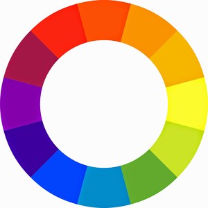
Understanding color and how colors work together is the key to getting the blends you want. I know, I know, color theory is boring and complicated. But fortunately, it doesn’t have to be either. The truth is, you don’t have to know a lot of fancy art words or terms to get the most out of your colors. You really only need to understand one thing: how each color connects to every other color. To do that, all you need is a color wheel.

Wheel of Fortune
The modern color wheel is divided into twelve sections, with each section containing either a primary, secondary, or tertiary color.
The primary colors are:
- Red
- Yellow
- Blue
The secondary colors are:
- Orange
- Green
- Purple
Secondary colors are a mixture of two primaries. Red+yellow=orange, yellow+blue=green, and blue+red=purple.
The tertiary colors are:
- Blue-purple
- Blue-green
- Yellow-green
- Yellow-orange
- Red-orange
- Red-purple
Tertiary colors are a mixture of a secondary color and a related primary color.
Blending Colors is Easy
With a color wheel in hand, blending colors is easy. There’s only one rule you need to remember: you can perfectly blend any two colors together by connecting them through the color wheel, so long as the lightness or darkness (value) of each color is the same. Let’s take a look at how this works.
For our first example, let’s take a look at two colors that are about as different from one another as we can get – blue and orange.
These two colors are polar opposites and therefore extremely difficult to blend together. If you just take the two colors and smash them together, they cancel each other out and turn a neutral brown-gray. Now don’t get me wrong, blending blue and orange together through their combined color of neutral gray is sometimes a good thing to do, but it’s often not very pretty. When the two colors mix together, they lose their unique identity, and for the purpose of this discussion, that’s not what we want.
A prettier way to blend these two colors together is to join them through their adjacent colors. For example, if we take a look at the color wheel, we can get from blue to orange by starting with blue, and moving through purple, to red, then orange. If we break it down it looks like this:

I’ll grant you, it doesn’t look like much when they are stacked side by side like that, but when we smash these four colors together, softening them into one another at their borders, we get a much more vibrant transition from blue to orange than if we simply blend the two colors together and let them mix on their own.

The trick to making this kind of color blending work is to keep the colors you are using very close in value. What that means in normal words is that each color you use should be the same or close to the same degree of light or dark. If you squint your eyes when you look at the color bar below you will notice how all the colors almost disappear, that’s because they are all very similar in value.

As long as we keep the lightness or darkness of the colors we are using the same, we can blend any two colors together perfectly.
Let’s take a look at some real world examples using Copic markers as the medium. It’s important to realize that I didn’t use any special blending techniques like “flicking” or “flooding” and I didn’t use a colorless blender. I simply chose colors that would naturally blend well together based on their value.

In this example, I’ve used:
B26
V16
R27
Y08
YR68
Notice how the last numbers move smoothly from 6 to 8? The last number represents the specific value of each color I used. We can also go around the color wheel in the opposite direction.

Here, I’m moving from red to green, through orange and yellow.
In this example I’ve used:
YR68
Y36
Y08
YG07
Again, notice how close the last numbers are. Keeping them similar is the key to this kind of blending.
As you can see from the bars, I’m smashing nearly every color in the spectrum together in a smooth blend, all by keeping the value range close. The cool thing is that this type of blending works awesome on all types of objects. Including skin.
Believe it or not, the colors I used for this drawing are these:
 I’ve simply lightened them up and blended them out…..

In this example I’ve used:
YR00 (orange)
E11 (yellow-orange)
E53 (yellow)
E81 (yellow-green)
B00 (blue)
Using this blending technique and these colors for skin is the best way to get natural looking light skin tones.
Let me show you what I mean.
The gradient below is the way most people color skin:

In this example I’ve used:
E00
E11
E59
E13
That’s a lot of earth tones, seems only natural, right? Now do me a favor. Take a look at your arm. Come on now, really look at it. How many of the colors from the image above do you actually see in your own skin? Not many I’ll bet. Now take a look at the orange to blue light value gradation we did earlier and compare that to your arm. Can you see how those colors, especially the ones in the middle, more closely match the actual skin color of a light-skinned person?
If you have darker skin and want to know what colors are best, you can find out here:
How to Color Dark Skin Tones With Copic Markers
So there you have it. The secret to getting good blends is less about the specific media you use and more about the colors you choose to blend. Planning ahead before you color or doing small color studies to work out your color combinations in advance will automatically result in better blends.
The techniques we’ve used above work with any medium, from colored pencil on paper, to ink on skin. Give it a try and see what you think. Just remember to keep the values similar.
Honestly, the only reason you have trouble with blending is because the values of the colors you are using are too far apart.
Happy coloring, and as always, leave me a comment, or better yet, post your efforts in the comments below.
How helpful was this post?
1 Star: Oh man, that sucked… 5 Stars: Good God, it’s brilliant!


An excellent explanation on blending :o)
Thank you Tina, I’m happy you liked it!
This explanation has opened up new horizons to me. I’ve noticed the multitude of tones in the skin before, but never really managed to make it work in my paintings, and now I understand how the technique can actually work. I’m going to make some more studies to understand it better in practice now! Thank you for your tutorial, as it just guided my way to understanding!!
Wow, what an awesome comment. Thank you! Comments like that are the reason we do what we do. Please feel free to post your studies here, I’d love to see them.
Thanks for this Christopher, I am glad you are better at blending then you are at cooking (referring to latest email). Then again you would not be doing these tutorials if you were not good at it. I am coming along in my goals to become a reasonable artist (no illusions of grandeur here) using cross hatching to blend two colors to make a third and managed a reasonable picture of an octopus, even if I do say so myself. But back to topic your emails and tutorials are inspiring so please keep up the good work, but no more pretend fires as I almost sprayed tea over my screen.
LOL Lynda, unfortunately you can’t eat blending, just kinda leaves you empty inside 🙂 Thank you for sharing your drawing with us, the cross hatching to blend colors is an awesome technique. Great work!
finally got this octopus downloaded, my first attempt at cross hatching
Nice work, Lynda. Thanks for sharing! I particularly like the subtle blue and orange complementary color scheme. Nice work on the cross hatching too 🙂
Pingback: The Best Alcohol Based Markers for Artists- 2018 Buyer's Guide | Craft + Leisure
A very conscientious explanation of the nuances of blending. Great job!
10 all around. Thank you
Hello!👋🏼
Im Sharon and im trying to find tutorials and learn more about markers and copics specifically. May i ask what does it mean to brighten the colors? How do you brighten them
GetInsta is a free Instagram growth app that helps users increase their followers and likes without any risk. Unlike other apps that rely on fake accounts or bots, GetInsta works on a points-based system. https://instanderaps.com/getinsta-apk/
Spotify x APK is a great option for users who want premium music features without paying. It offers ad-free listening, unlimited skips, offline downloads, and high-quality audio for an enhanced experience. If you are tired of other music apps, this advanced mod version is worth trying. It also allows saving unlimited songs and podcasts while blocking unwanted ads. Just make sure to download it from a trusted source to stay safe.
Great insights! I loved how you emphasized the importance of mindfulness in blending different media. It’s fascinating to think about how our mental approach can significantly enhance the creative process. Can’t wait to try out some of the techniques you mentioned!