I have always hated the word realism, at least as it applies to art. I think it’s because I’m not really sure what the word is supposed to mean exactly. In fact, not to get all existential on you here, but I’m not really sure the words art and real in any form actually go together very well.
If you look up the word real in the dictionary (online of course), this is what you’ll find:
Real
Actually existing or occurring in fact; not imagined or supposed.
By that definition, it seems impossible for any work of art to be considered realistic. Oh sure, the work itself is a real thing, it’s composed of matter and has all three dimensions, but when we try to apply the word real to any type of subject matter things start to fall apart.
For example, with the definition of real given above, it would be impossible to paint a realistic mermaid, dinosaur, or any other thing that can not be directly observed as existing in nature.
Even painting things that do exist and can be observed doesn’t qualify those works as realistic, no matter how much fidelity to the real world we may strive for. You see, the colors we use do not, and cannot, accurately mimic the color of light. And since color is a phenomena of light, there is no way we can capture realistic color with the colors we have at our disposal. The best we can do is render an impression of light, and impressions by definition are not an accurate reflection of what is real.
Using the word ‘realism’ instead of ‘real’ doesn’t help either.
The same dictionary defines realism as:
The quality or fact of representing a person, thing or situation accurately or in a way that is true to life.
Again, not very applicable to art. I suppose we could say a realistic portrait or landscape fits the definition fairly well, but even then we run into that pesky color problem, and we are still talking about pigments on a flat surface representing our impression of whatever it is we are looking at.
Honestly, when it comes to defining the real, I gotta tell ya, Morpheus said it best.
“What is real? How do you define ‘real’? If you’re talking about what you can feel, what you can smell, what you can taste and see, then ‘real’ is simply electrical signals interpreted by your brain.”
Believe it or not, that’s the definition I’m going with! Because with that definition, a whole new world of possibilities opens up.
If real is simply our brain’s interpretation of outside stimuli, then anything can appear real or realistic so long as we follow the basic rules of light in nature. With this definition, any reality is simply an impressed or imagined reality, and imaginary realism is exactly what we need.
Imaginary Realism
For our purposes, and in my opinion, for the purposes of most art, imaginary realism is the thing to shoot for.
Let’s define imaginary realism as:
Making a two dimensional drawing or painting appear solid and three dimensional by representing the subject matter in values of light, shade, and color, regardless of whether or not the subject being represented actually exists in nature.
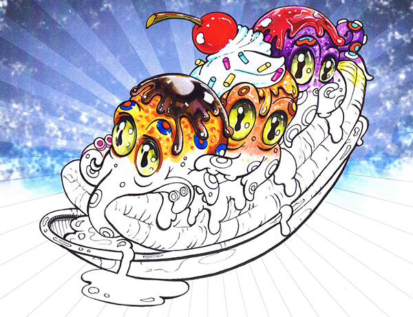
With this definition we can make “realistic” drawings of any subject we choose. Mermaids, space creatures, anamorphs or octopuses on ice cream cones. You name it, we can do it. All we have to do is work to make each object in our drawings look solid and three dimensional. Our drawings can still be imaginative, and they don’t even need to look photographic, they just have to obey the basic laws of light and shade.
So in the spirit of the new ism we’ve just discovered, let me show you how I color an imaginarily realistic, goofy little octopus with chocolate sauce on top.
Step One: Base Colors
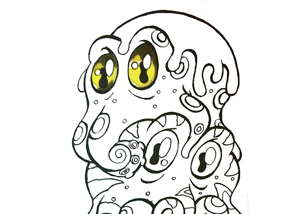
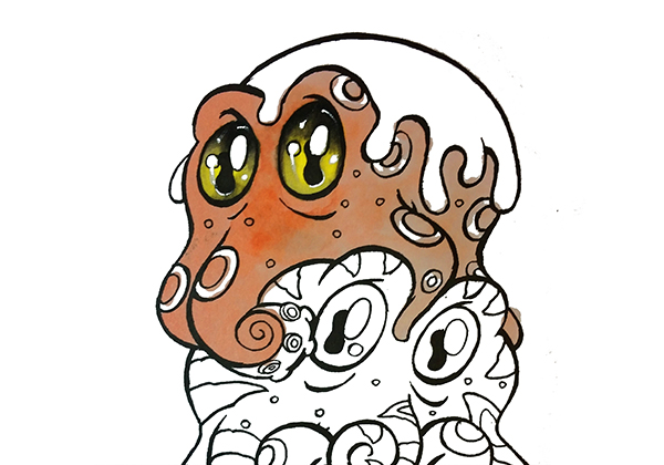
For this drawing, I will start with the eyes. For each of these little guys, the eyes will be the focal point, so getting them just right is critical to the overall success of the finished drawing. To begin, I lay in a flat, even layer of Y11. I use this color over the entire eye area except for where the white highlights are indicated.
I then lay in areas of dark at the tops and bottoms of the eyes with W7. This color will help add depth to the eyes and make them look round and three dimensional.
The value difference between these colors is very large but I don’t worry about trying to blend them. I just lay them in flat and even knowing that the layers I put over the top in the next step will blend them perfectly.
Step Two: Blending
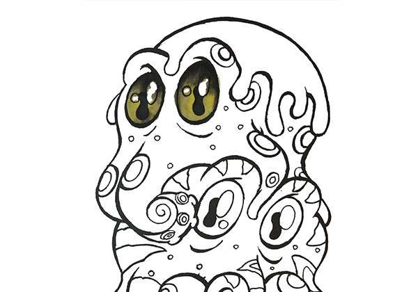 Next, I color in areas of W2. I use this color to soften the transition between the Y11 and W7, and in areas along the edges of the eyes. In the areas where the Y11 and W7 meet to form an edge, I scrub this color in with firm pressure, really saturating the area with ink and letting the lighter W2 lift and mix with the W7 to make an intermediate value.
To “blend” all the colors together, add another layer of Y11 over the entire eye area, including the dark at the top and bottom. This layer smooths everything out and makes the colors merge into one another exactly the way I want them too.
It’s important to note that with this many layers in such a small area, the paper below becomes soaked with ink so much so that the colors start to bleed outside the lines. I don’t care! I count on this bleed to get the blend I like and I know I’ll color over the areas that bled out and no one will ever notice.
Step Three: Highlights
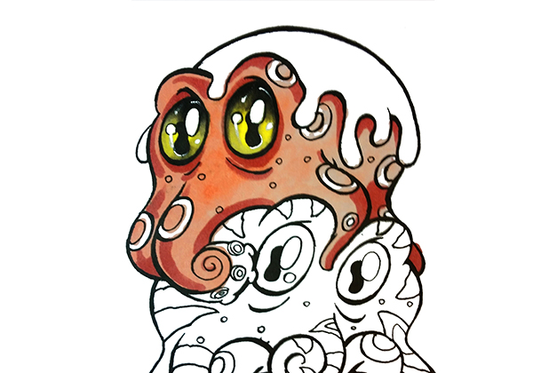
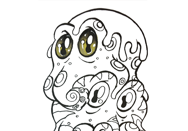 To finish off the eyes, I add my white highlights with M. Graham & Co. Titanium White Artist’s Gouache. I use this white for all my drawings, mostly because it’s nice and opaque, and because I can remove it with water and a cotton swab if I mess up. To learn more about the different whites you can use, read this post.
To color the octopus’s body, I’ll follow exactly the same coloring procedure as outlined above:
- Base color
- Shadows and darks
- Layer the colors over each other to blend
- Highlights
I color this way on every drawing I do and I always finish each area completely before moving on to the next. I never color the drawing as a whole.
In this photo I have applied a base color of R11 over the entire body. I’m not worried if the color looks splotchy or uneven since I know I’ll be adding more layers over the top.
 After my base color is applied, I add my darks with E04. Again, no blending and no concern if the color goes in smooth. I’m simply indicating where the forms turn away or round away from the imaginary light source. These darks are just the thing to add that feeling of a rounded solid form, and will help bring my imaginary Octo to life.
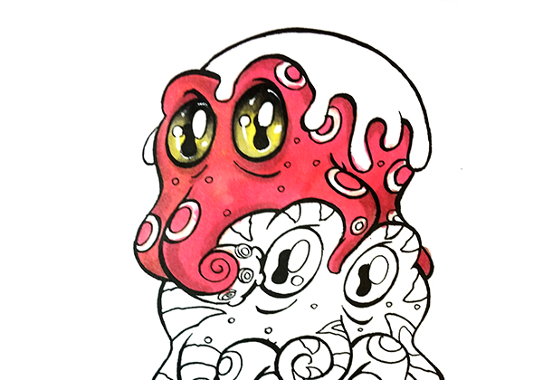 Next comes the blending step. Because I want this guy to really pop of the page, rather than blending my darks down with the same R11 I used for the base (which is kind of a dull, light color), I color over the entire body again, including the shadows I added in the last step, with a brighter stronger RV13.
Because the markers I’m using are intrinsically transparent, each of the under colors affect how the color looks when it’s applied over the top of them. Remember that splotchy area in the R11 base? Rather than becoming invisible, it shows through just enough to add a nice bit of variety and texture in that area. Pretty cool huh?
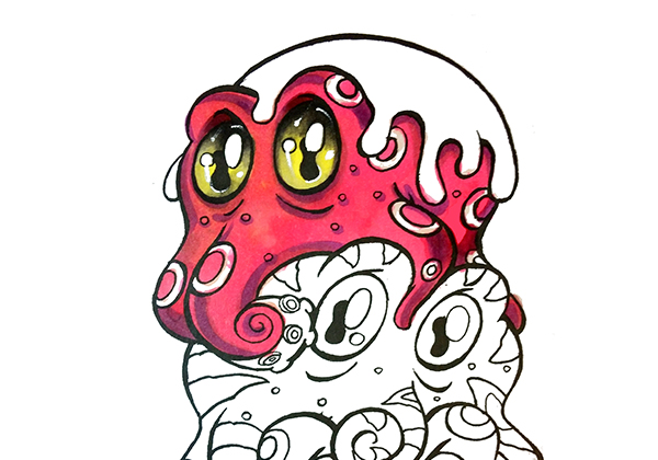 In this photo I have restated my dark areas with V15. I do this to strengthen the contrast and to add more color in the darks. Color is your friend and there are way more colors visible in everyday objects than most people take the time to see. I chose purple because it’s in the same basic color family as the RV13, but still different enough to add a bit of pop and accentuate the three dimensional qualities of the drawing.
After restating my darks, I color in another layer of my original base color R11 to soften everything together and homogenize the color scheme.
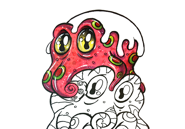 To finish off the body, I add texture in the form of dots all over. I think of these less as freckles or spots, and more as simple textures to break up the solid color areas and add interest for the eyes. I’ll use any and all of the colors I have previously used if I think they will look good and add interest.
I also color in the spots with a complementary green and red color scheme which will play off nicely with the red-violets and violets I’ve already used, and create an overall split complimentary color scheme between red, green and the yellow-green of the eyes.
Finally, I add my white highlights to make the body look shiny and to add to the three dimensional effect. When adding my highlights, I don’t confine myself to the strict laws of realistic placement according to light source. I use highlights for one reason only – to make the drawing look better. So I’ll put them wherever I think they will add a positive effect. This is an imaginary realist drawing after all, and since no one has ever seen a real goofy bug-eyed octopus on a real ice cream cone, who’s to say what is right or wrong?
Rule of the day….. if it looks good then it’s right!
The Secret Sauce:
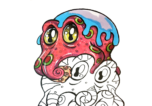
Coloring the chocolate sauce on top is the final part to this tutorial. Because chocolate sauce is very dark, I have the opportunity to add tons of color to this area. Most people don’t realize that the human eye is not very sensitive to color changes in dark values. Because of this, when we add tons of color to the dark areas of our drawings, they still look like the right color but they feel more alive and vibrant.
In this photo I lay in my base colors with B02 and BV00. As before, no blending needed.
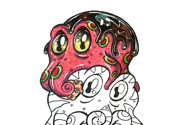
To finish it off, I use exactly the same procedures as before. Base, add darks, layer to blend, restate darks, layer the shit out of it ’til it looks good using whatever color I think will work, add highlights.
The colors used for the chocolate sauce were:
B02
BV00
E29
E99
If I were to finish the whole drawing, the basic steps would be the same and I would complete each area one at a time. In my opinion, this really is the best overall approach and it’s hella fun to do.
How helpful was this post?
1 Star: Oh man, that sucked… 5 Stars: Good God, it’s brilliant!
![]()
![]()
![]()
![]()
![]() (130 votes, average: 4.56 out of 5)
(130 votes, average: 4.56 out of 5)![]() Loading...
Loading...

That was supposed to be 5 STARS…not 3…lol!!…. My fingers aren’t working this morning. Thank you for
this tutorial. I have Copics and have yet to even take the caps off…lol. Not so scared now!
LOL! Go ahead take the caps off! It’s hard to color with them on! Lol! Copics are actually a very forgiving medium so no worries just color!
Loved this tutorial and loved colouring these guys!!! I used pencils (because I only have sucky markers 😛 ) but learnt a lot and I love the idea of using dots as a texture. Going to use it more often! Thanks!! 😀
Hi Jayne, I’m super glad you liked them! I’d love to see what you’ve done. Please feel free to post your images here in the comments section. Happy coloring!
yep, pencil crayons and cheap markers is it here, love to be able to blend. will see how it works with what I have.
Let’s see if this works…
So sorry Jayne, I was unaware that our image uploading was not working! It’s all fixed now if you want to give it another try 🙂
Here goes nothing LOL
Jayne, this is so amazing! I love the way you handled the background, I love the color scheme, everything about this is awesome. I especially love the way you use the dots as texture. It’s so amazing! This really is an incredible coloring job, thank you so very much for sharing it with us.
Thank you!!! 🙂
Wow Jayne. I love that:). So cute. What “sucky markers” did you use?
LOL I have this weird no name brand that I bought while I was on holiday in December. They have no name on them. Then, my husband bought me two kinds of Bic markers. One of them are kind of cool. They come with an eraser marker. I used all three sets for the dots and the little details. I can’t colour large areas with any of them because they aren’t smooth. They streak and bleed. It’s just a big fat mess. So the large areas I did with my pencils after doing lots and lots of dots with markers 🙂
here may i acquire this drawing to do this tutorial please?
Hi Judy, now that you’re signed up, it’s on its way! Look for it in the next day or two 🙂
Loved this tutorial. You explain how to do each step so well. I love to color and have to admit I am quite addicted, although I could use a lot of practice… Unfortunately I only have two Copic markers. I will continue to read your tutorials, I’m sure I can learn a lot
Thank you Kaytie, I’m glad you liked it. Would love to see some of your work. Feel free to post up a drawing or two here 🙂
How long does it take you to do the first step (before you covered it in chocolate sauce)? I’ve heard you need to work pretty quickly to have the best blending ability, but don’t know if that’s true. I’ve been trying to work really fast, but it would be nice to have a little more time
Hi Sara, you do not need to worry about speed at all. My commission drawings take me up to 30 hours to complete and I add layers to colors that have been dry for days. The only time speed plays any role in a Copic drawing is when you’re laying in your base colors and you want them smooth and even. But if you check out the “Get Smoother Colors Quicker and Easier” video, you’ll see that you don’t even need to worry about it at all.
I will print it later I don’t have very good markers, colored pencils or watercolor =_= lol but I will try and add my own little twist
Rose, the basic concepts in this post are pretty applicable to any coloring media, and I can’t wait to see how you twist this. Please feel free to post your finished drawing here 🙂
Very helpful – ideas to assist with making colours pop and blend
Thank you Myrna, I’m glad you liked it!
I have yet to try copic markers, but in addition to being an incredible artist, you’re also extremely funny, so I’ll definitely be back. I tend to obsess about things; so when I bought my first coloring book…………I bought about 20 of them, along with a variety of pens/markers/pencils to use. Right now I suck pretty bad at coloring; (who knew it was this hard????) but I intend to keep trying.
Thank you Georgia, you’re way too kind. I’m sure you’re better than you think you are, but if you want to get even better you’re in the right place. And trust me, you’ll love Copic markers once you try them 🙂
ROFL Georgia – I am so glad that I’m not the only one who does this!
I am loving these video’s that you are doing. Very informal which I love and not intimating. When I see things that other video’s refer to as mistakes (bled outs, coloring on areas that were not meant to color on, etc) I always feel like I should not be making these mistakes so I am not any good. Thank you for being open and honest.
Thank you for the kindness Sharman, I’m glad you like them. Comments like this are the reason we make these posts. It’s so important as an artist to remember that “mistakes” are part of the process and not something to get down on ourselves about. It makes me sad when artists feel like they are ‘not good enough’. When I hear an artist say that, I always like to respond, “you’re better than you think, you just don’t know it yet.” 🙂
Great tutorial, thank you!
You’re welcome, Lynn. Glad you liked it.
Awesome tutorial, thanks a lot for sharing your knowledge Christopher 🙂 Waiting for the next one 😉
Thank you Miquel, I’m glad you like them! We’re making more as fast as we can 🙂
Hey I really really love your tutorial and would like to buy this awesome book but you dont ship to Germany! :'((((
Hi Louise, shipping the coloring packs overseas costs more than the coloring pack itself. We do have these available digitally so that everyone can enjoy them no matter where they live 🙂
Love the tutorial. I did learn a lot from it and will be trying the technique on some upcoming projects. Will be looking forward to more tutorials. Thanks ever so much.
Thanks Jean, can’t wait to see what you do!
Thank you for tutorial! I am so intimidated by these markers!
Worse colorer EVER!!
I am going to conquer this.
Thanks again!
Hi Karen, we’re happy to have you here! Don’t be scared of the markers, they don’t bite 🙂 Seriously, the mistake most people make is asking “What can these markers do?”, when the question they should be asking is “What can I do with these markers?” The trick is to just get in there and make them do what you want them to do, they will do it. So pop the cap and get coloring! Best way to get better is to color all the time 🙂
This is a really great tutorial! I’ll be sure to give it a shot when I have time.
Thank you, Sydney. Please post your work up here when you do 🙂
Love this tutorial. I have some Copic markers and have been to afraid to use them.
In the tutorial towards the end after you got all the body colored you say you go backand add the whit highlights.
How? How do you color white over the red/pink body?
I really want to understand how that is done.
Thanks for your helpful tutorials! ?
Hi Christin, if you haven’t yet, please check out the “Use the Right White to Highlight your Copic Drawings” post, and the “How to Color Skin, Part 5:
Textures and White Highlights” video. Pretty sure you’ll find the answers you’re looking for there 🙂
Thank you! Great tips! ?
Thank you so much!!! Really great ) will try as soon as possible!!!
You’re very welcome, Katerina! Please be sure to post your results here when you’re done 🙂
Love the video, now to try and win some markers so I can play along too! Be so Sweet! Great job on the video , thank you Christopher!
You’re welcome, CJ. Good luck!
Thanks for the tutorial! I use mostly DS watercolor paints for their vibrant colors and smooth, even application, but you have intrigued me. My art is all about color, and I am always looking for ways to bring rich vibrancy to my work. I may need to buy some Copic markers now. Thanks again!
Hi Becca, thanks for the kind compliment! I’m generally familiar with most types of art media, but I don’t think I’ve ever heard of DS watercolor paints. I would be thrilled if you would post some of your work here for me to see! When it comes to vibrancy, it’s hard to top Copic markers, but I’m curious to see how they compare to what you’re currently using. Looking forward to seeing your work 🙂
Sorry, I shortened Daniel Smith to DS. I have been buying up Daniel Smith watercolor paints as I can afford to for the last year. They are a great product, but it takes me up to a week to finish a small painting.
This is one in a series. You can see more at http://www.congruentstudios.com
Rebecca, these are lovely! Thank you for showing me. I’d love to hear more about your sales and marketing strategies. With works like these you should definitely be generating a decent income.
Pretty amazing Christopher. I have six copic markers – the face colors and they definitely make a lovely face! But I have never purchased more. My go to marker are the FC Big Brush/Pitt Pens. I use them in all my paintings. Someday I would enjoy experimenting more with your Copic Markers. Just wanted to say thank you for the interesting step by step today. j.
Hi, thank you for the compliment! You’ve got good taste in brush pens 🙂 I’ve done quite a bit of work with the FC pens, and they’re pretty cool. Gotta tell you though, I love Copics even more. Feel free to post some of your work here, I’d love to see it!
I love how this is done. This drawing and coloring is marvellous! I have no Copics of my own but I own 9 Prismacolor markers. I do what I can with those. You are very kind of replying to each of these comments. You are an amazing blender I must say! I thank you for reading this and sending the emails with this tutorial and colouring page!
Thank you, Claudia. You are too kind! I’ve used Prismacolor markers as well, and they are a good second choice after Copics, but you need more than 9! 🙂
Great tutorial! Don’t have any copic markers just gel pens and pencil crayons. Love coloring since childhood. Thank you !
You’re welcome, Nancy! Given the materials you do have, what kind of tutorials would you like to see from me in the future?
Would like to see various methods of shading with the gel pens. Using Fiskars 48 gel pens and Sargent fluorescent and metallic gel pens.
Fantastic tutorial. Would love to win the Copic markers contest going on. Will have to try your technique. TY for sharing.
You’re welcome, good luck 🙂
Excited to get my comics out of their box… Moving to a new location cost my studio temporarily but I don’t have the patience to wait for my own space. Now that the weather is warming up I plan to hide away on the screened in porch and Copic until my hearts content… Thanks for the inspiration to find their box in the back of the closet 🙂
Sorry about the typos
Sounds like a great plan 🙂 Thank you for the kind comment.