What’s This All About?
A few weeks ago I did a tutorial on blending. In that article, I discussed the idea that the best blending starts in the mind and not the marker. While it’s a true statement that we should blend with our minds before our markers, it’s also true that blending requires the physical act of laying one color over another. So this week I’m going to show you how to use your markers to get good blends using your markers AND your mind.
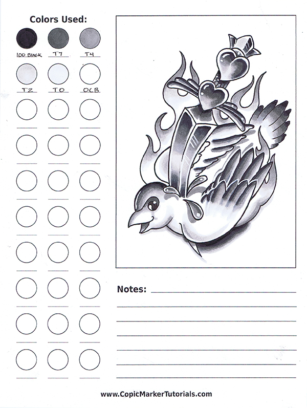
For this tutorial I’ll be creating a drawing in the style of traditional tattoo flash. In an effort to keep it as clear and understandable as possible, I’m limiting my pallet to four colors from the Toner Gray family.
The colors I’m using are:
- 100 Black
- T7
- T4
- T2
- T0
- 0CB
Notice that there is only a small value difference of 3 or less between each successive marker. Keeping the values in this range makes blending easier. It’s been my experience that blending markers that are four or more value numbers apart requires more work than necessary, so I try to keep the numbers as close as possible without having to use too many markers to do the job.
Backwards Blending
In an effort to stay true to the traditional techniques of making tattoo flash, I’ll be blending backwards for this tutorial. If you’ve done much investigation online on how to blend Copic markers, you know that the recommended blending order is to go from light to dark. The reason the light to dark method is recommended is because Copic markers are solvent based. When we lay one Copic color over another, the solvent in the top color has the effect of lifting and lightening the color underneath. This effect is especially noticeable when we color a light color over a dark.
So when we want to keep our darks as dark as possible, putting them in last is the best way to go. But blending from dark to light has its place too. Especially when you only have a few values of each color. With fewer colors at our disposal, the lifting and lightening effect of backwards blending allows us to create smooth transitions by lightening the darker color.
So let’s get to it.
Step 1: Lay in Your Blacks

In this step I’ve placed all my blacks in their appropriate spots. I’m imagining the flame behind the dove to be the light source. Technically a light source like this would illuminate the dove from all sides, but that would make for a flat, boring image. So I’ve decided to make the strongest light coming from below. That means in this drawing, my blacks all need to go near the top edges of my forms.
Technical note: In order to have the most control when drawing near an edge or line, point the tip of the marker toward the line when laying in your color.
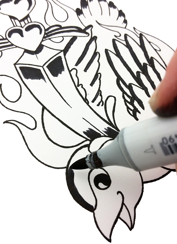
Also notice how the back end of the brush nib leaves an uneven, bumpy edge. This is a good thing. That rough edge is easier to blend out than a hard, crisp edge.
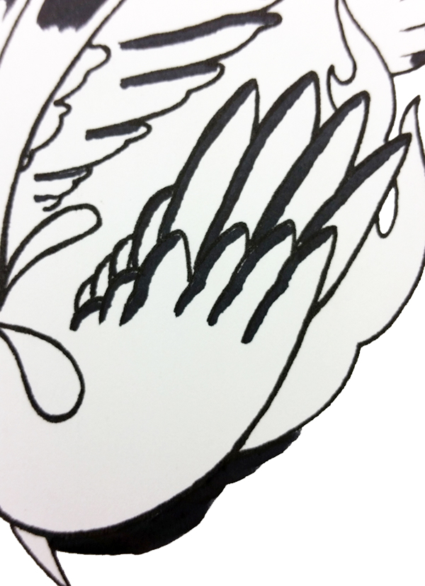
Step 2: Laying in the Next Darkest Value

When I lay in the next value, I make sure to overlap the edge of the black. Notice how the T7 blends almost perfectly with the black without any actual “blending” on my part. This is a good example of how markers with a value difference of less than four blend together naturally. You can see this effect more clearly in the short video below.
Step 3: Laying in the Mid-tones
In this step I lay in my mid-tones. The alcohol in the T4 lifts and lightens the ink at the rough edge of the T7 I used in the previous step. With only one layer like this, the blend isn’t perfect, but it’s a good starting point. I have intentionally left the blending a bit rough in these photos so you can see how the values look up next to each other before softening them all together.
Step 4: Laying in the Lightest Values

To complete the gradation I lay in the lightest values. Once all of my primary values are placed, I’ll soften everything together with the T0.
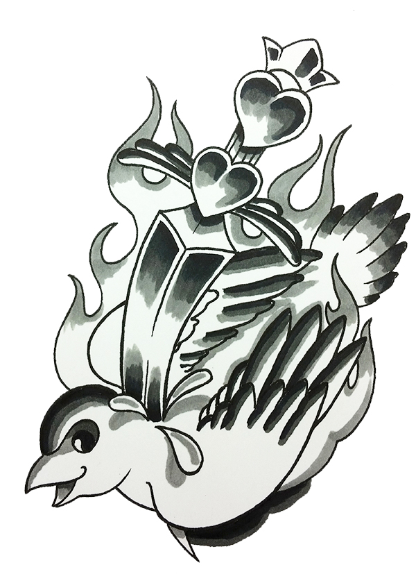
Here’s how the finished drawing looks after blending.
I’ve left the values a bit strong so they will show through the transparent color layers that I will ultimately apply over the top.
To learn how to add color to a grayscale drawing, click here:
What the Hell is Grisaille?
The paper I’ve used for this drawing is 100 lb. smooth Bristol board. The template shown in the final image and video is one of the practice sheets I’ve created to help me work out my color schemes before working on an important drawing. Using a template like this allows me to practice new techniques and keep track of the colors I’ve used and the things I’ve tried. I find them to be invaluable when starting a new drawing, and after I’ve completed one, I have a record of what works and what doesn’t.
A Final Thought
Getting great blends takes thought and practice, mind and media. We’ve all heard the saying ‘practice makes perfect’, but practicing a new technique on an important drawing or coloring page is never a good idea. It’s always best to keep the practice and the performance separate.
How helpful was this tutorial?
1 Star: Oh man, that sucked… 5 Stars: Good God, it’s brilliant!
![]()
![]()
![]()
![]()
![]() (43 votes, average: 4.74 out of 5)
(43 votes, average: 4.74 out of 5)![]() Loading...
Loading...

Wow that’s awesome
Thank you, Sandra!
I ❤️❤️❤️ these tutorials!! ?
And they love you right back! Cuz you’re awesome!
Cool Beans!
Bacon! 🙂
You really stressed me out with that “don’t click me” button … it was TOUGH for this rule follower! 😉
LOL Sara, I’m glad you clicked it! See, sometimes it’s nice to break the rules 🙂
That is a REALLY good tutorial. I’m new to Copics and this info is great
Thank you, Cindy. I’m glad you liked it!
This helps refresh my memory of how to use Copics for shading and blending. I’ve seen the CD, but it’s been a while since I last saw it. Your tutorials remind me of details I may have forgotten. Thanks for sharing your knowledge with us.
Thank you for the kind comment, Ruth. You are very welcome. I’m happy this served as a reminder 🙂
end product looks fab
Thank you, Erica 🙂
Didn’t know Backwards Blending was the name for the technique XD I actually prefer this technique; the blending gets softer. Somehow I cannot get ‘normal’ blending to work.
Hi Kitty, I know exactly what you mean! I actually use both methods myself, but this one does produce softer blends when used correctly. Would love to see some of your work, please feel free to post it up here 🙂
Ah, thanks 🙂 Well, I haven’t scanned my latest piece, but I consider these two decent 🙂 http://fav.me/d9toygh and http://fav.me/d8j48pz
I still have issues with the ‘normal’ blending, so patiently awaiting the tutorials/tips for that 🙂
These are great, Kitty! Thank you for sharing them.
Thank you for the tutorial. I’ll be braver at trying blending techniques. I so admire your talent.
Fortune favors the brave 🙂
Thank you so much for tutorial! Really love it!
Could you please tell me about the toner family. Is it just a grey family or you can tone something with it?
Katerina, the toner family of grays are awesome, and yes, you can tone any color of the same value with them! You can do the same with any of the Copic grays, but they have a greater effect on the color being “toned”. The toner family seems to effect the colors being toned less than any of the other Copic grays.
Wow at last some truly useful information on how to make the most of copics. Thanks heaps.
You’re very welcome, Rosy. I’m glad you liked it and I’m very happy you’re here 🙂
Thanks for the tutuorial. Are you using Copic white for highlights or acrylic paint or guache?
Hi Ellen, I use white gouache exclusively for my highlights. You can see my comparison of the various highlight mediums here: https://copicmarkertutorials.com/use-white-to-highlight-your-copic-drawings/
Thanks Christopher, Imhad seen that but wasn’t sure which you preferred.
Marvelous job!! How long have you been doing this; professional copic art??
Thank you for sharing!!!
Hi Gay, thank you very much. I’ve been creating art professionally for quite a while. I’m actually a classically trained oil painter. I discovered Copic markers about 3 years ago and immediately fell in love, so I’ve been doing Copic art professionally for about 3 years now. And I’ll be honest, after switching to Copics I haven’t picked up a paint brush since.
You are soooooooo good with the copics! I use the chio, are they the best ?
Hi Gay, thank you very much, I soooooooo appreciate it 🙂 There’s absolutely no difference in the quality between the different Copic markers, so yeah, Ciao is the best! So are Sketch and Original 🙂