 Coloring dark skin tones can be a challenge, and the truth is, there’s not a lot of good information out there to help. Oh sure, a quick search on how to color dark skin with Copic markers will bring up tons of tutorials, but do you really need a tutorial to tell you that a combination of E25, E27, and E29 will let you color your characters brown? Besides, if you’ve read any of my other posts, you know brown doesn’t exist, and no combination of any three E’s will make a believable flesh tone, light or dark.
So what’s the secret to realistic dark skin tones? Color. Lots and lots of color. Believe it or not, dark skin tones are loaded with color. There are blues and greens and purples and yellows, reds and grays too. In fact, the only colors that are poorly represented in dark skin are brown and black.
The Key to Dark Skin Color
If color is the secret to coloring dark skin, then saturation is the key to making all that color play nice together. While dark skin is loaded with color, most of those colors are super desaturated. You can put nearly any combination of colors together and keep them harmonious if you keep the saturations low. Thankfully, controlling saturation with Copics is easy. You can either choose desaturated colors to begin with by selecting colors with their first numbers in a range of 4 or higher, or you can desaturate your color with layers. Either way works well, but I like the second one best, and it’s the method that I use in this tutorial.
The Basic Technique
My approach to coloring dark skin tones is really pretty simple.
- Load the base layer with tons of bright color.
- Desaturate the base layer with multiple layers of grays and browns.
- Repeat/refine
- Add details.
Let’s go through them one at a time.
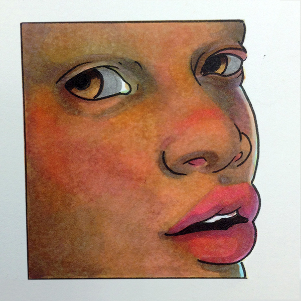
Step 1: Load the base layer
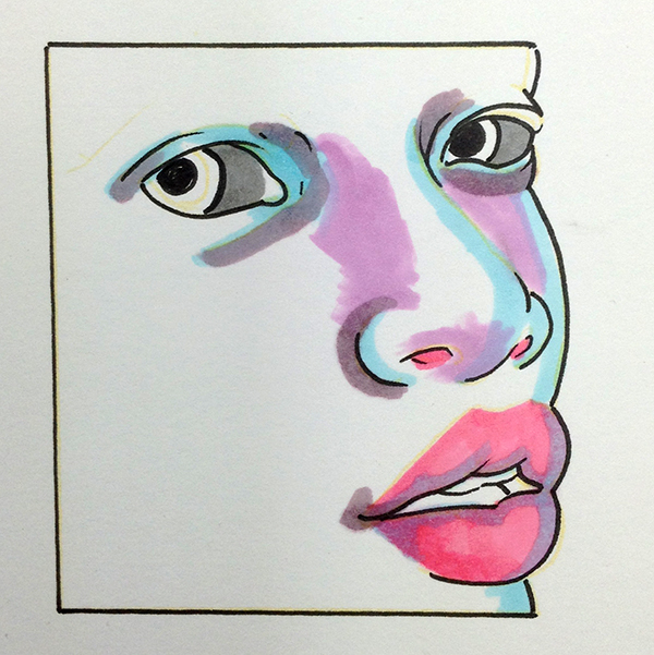
This is the fun part. In this step, almost any color is fair game. I’ve used RV13 and B00 on the lips, B00 and BV00 on the nose and in the eye sockets, and YG91 for the greens. That light pink color is R02.
For the darker areas, I’ve used RV95, V95, and V12. These colors are visible on the cheeks and eyelids.
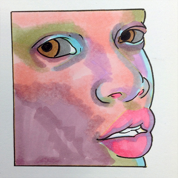
Step 2: Desaturate
To desaturate the colors I used in the base layer, I use E23, E33, E55, E57, E70, and E71. I color each of these colors, more or less, over the entire skin area, except the eyes and lips, and layer one color over the other until I get the effect I’m after.
Step 3: Refine
In this step we are back to anything goes. I’ll lay in any color I think will help soften the color transitions and bring out the form.
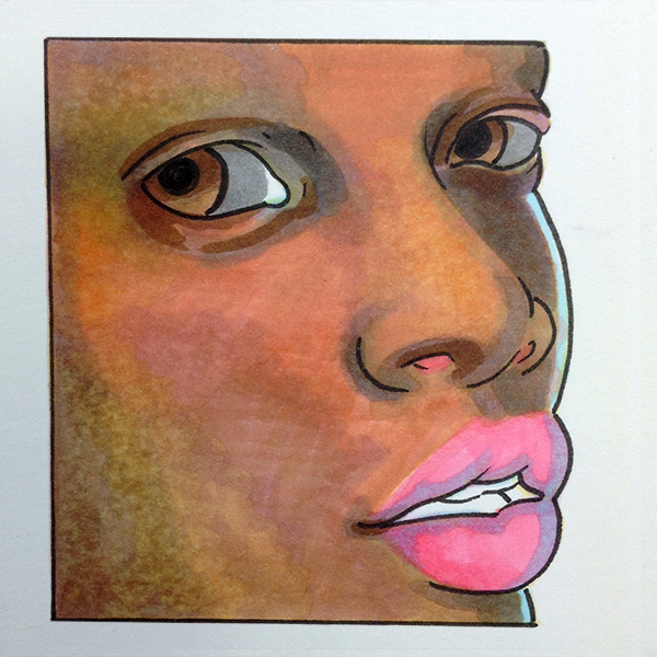
Step 4: Details
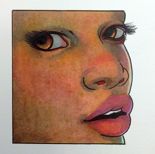
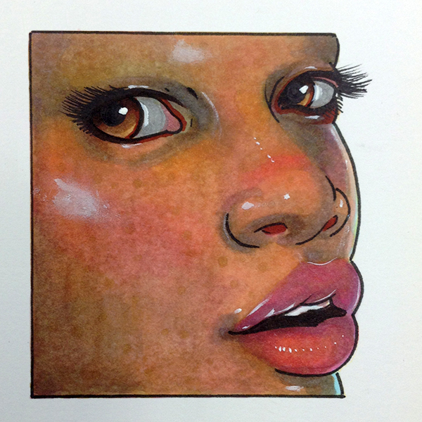
In this step, I add the blush to the cheeks and the textures to the skin. I also add the lashes, and accentuate the eyes with E49 and E09. The area around the lashes is the only place in the whole drawing where I use a traditional, brown colored marker. To finish the drawing, I add highlights with white gouache, and smudge it with my finger to soften it before it’s dry.
So the next time you need to color dark skin tones, give this method a try. You don’t need to use ALL the colors I’ve used, or even the same colors, but the basic method is the same: start light and bright, and then layer your darks over to create beautifully translucent dark skin.
Let me know what you think in the comments below. I could do a video on this technique, but if you want it, ya gotta say so.
Colors used in this drawing:
E23 Hazelnut
E71 Champagne
E33 Sand
E09 Burnt Sienna
E55 Light Camel
E70 Ash Rose
E04 Lipstick Natural
E57 Light Walnut
E49 Dark Bark
R02 Flesh
R20 Blush
RV95 Baby Blossoms
RV13 Tender Pink
V12 Pale Lilac
V95 Light Grape
B00 Frost Blue
BV00 Mauve Shadow
Y21 Buttercup Yellow
YG91 Putty
W-5 Warm Gray No.5
T-2 Toner Gray No.2
How helpful was this post?
1 Star: Oh man, that sucked… 5 Stars: Good God, it’s brilliant!
![]()
![]()
![]()
![]()
![]() (45 votes, average: 4.36 out of 5)
(45 votes, average: 4.36 out of 5)![]() Loading...
Loading...

Great idea, smudging the white gouache for a softer highlight. I’ve been using white colored pencil or white chalk, but the results don’t look as good as the gouache. I’ll have to try that.
Yep. Not a big fan of either of those for highlights but I do like the Gouache 🙂 it’s removable too!
Thanks so much for this! I have a much better idea how to color darker skin now 😀
My pleasure! Can’t wait to see how you use the technique!
That was super helpful! I have several dark skinned characters, but always have avoided drawing them since the skin coloring looked crappy. I’ve also got to try the Gouache for highlights! 😀
Thank you Isabel, I’m glad you liked it! I’d love it if you’d post one of those characters here after you’ve colored it!
Excellent!!! Yes a video would be great! I can’t wait to try this out!!
Glad you liked it! I’ll start thinking about a video for the technique 🙂
Please do a video on this technique. I’ve been attempting to do things like this through trail and error, with a lot more error. Thank you so much for this. 🙂
I’m on it 🙂 video coming soon!
yay! I can’t wait!
Wooooooow Chris, this is AWESOME. There are very few great tutorials on how to truly capture darker skin tones. Thank you for sharing!!!
Wooooooow Chris, this is AWESOME. There are very few great tutorials on how to truly capture darker skin tones. Thank you for sharing!!!
You’re very welcome 🙂 I knew you would like it! Thank you for the kindness!
Here! Thank you for sharing!!! I am glad I asked for it!
You’re welcome 🙂 I’m glad you asked for it too! What else would you like to see?
This is very much like te technique I used to use with Prismacolor ArtStix (see attached). I am excited to try it with Copic markers!
Dude, this is awesome! Thanks for posting!
I always liked layering with saturated colors. The thing that bothered me about Art Stix is the way the wax ‘beads up’ when you reach the saturation point. You can see it interesting background behind Rick James.
One GREAT thing about the Copic markers is that you can keep layering seemingly forever.
Of course there are consequences with any medoum once you reach its saturation point, but you really have to try hard – especially if you let the layers dry in between.
I know, right?!? It’s not uncommon for me to use upwards of 15 layers in any one area. There’s a common misconception that you can’t “blend” Copics after they’ve dried. But to be honest, I have no idea where that came from! It sounds like you are getting the hang of them quick!
So here is an experiment with Copic markers. I started with the approach you discuss in the post, and then started experimenting, even some with dipping a blank marker into pure color and 0CBF.
You’re right, the brighter colors underneath really help. Tgen the neutrals pull it all together. The skin tones just cone alive!
Great advice, Christopher – thanks!!
You are straight up smashing these! I think you’ll find the more you use them that they will do nearly anything you want them to. Your drawings already look as though you’ve been using Copics for a long while. I’d be very surprised if you don’t end up hooked on them. 🙂
(Oops, that should have been hete.)
One GREAT thing about the Copic markers is that you can keep layering seemingly forever.
Of course there are consequences with any medoum once you reach its saturation point, but you really have to try hard – especially if you let the layers dry in between.
I used this technique for this little skin tone study in colored pencil, and it worked great! Thanks for your tutorials. 🙂
Wow, Joanna, this looks great! Thank you for sharing. I particularly like the subtle variations in the skin tones. The pose is nice too 🙂 Great work.
Nice work Joanna! I’m liking the skin tones you have going on here. 🙂
I attend a weekly Long-Pose Life Painting session at a local gallery. I heard that this week’s model was KW, who has beautiful dark skin.
I went back and re-read this post, and did a small practice study before attending the session, and it really paid off.
Here is a progress photo.
I learned a lot from the experiment; patience, planning ahead, and maintaining a vision of where the drawing is going.
I would not have previously thought of using Copic markers as a fine art portrait medium, but it was darn fun. And I like the results. Copic markers get a cool look that you don’t see in other media.
I’ll have to do this more often!
🙂
Mikey, this is flat stunning, and I love that you did it from life! So cool! Seriously, man, great work. Thank you very much for sharing it.
I am trying to post my artwork so you can see! Well dang!
Oh I love this! Thank you for sharing!
Nice report on earth colors of pigments. I see taints of violet as an undertones of the strain color of “white people’s” skin. There is a TEMPERATURE difference in the color palettes for “white (light) and black (deep)” skin tones”. The cosmetic industry refers to the difference as being cool-winter or warm-autumn.
However not all “white” people have this trait. The palette colors for skin of people who’s origin is Scandinavia, is cool-winter and those from the Mediterranean is warm-autumn.
As a matter of fact, a palette for the skin tones of nearly all other humans is warm. But, this is dependent on the color of the light source reflected from their skin.
I do not think that I have ever seen a chart of hues of pigments for “white” (i.e. pinkish-violet) people’s skin tones.
.
Hi Rohn, thank you for the compliment. You’re absolutely correct in your assessment of skin tones (those are fairly deep insights, by the way). And I don’t believe I’ve seen a hue chart for Caucasian skin tones either. Maybe one of us should make one 🙂
This is great. It really does enliven the skin. (Where’s that videoooo?) how do u decide where to put the colors and which color to use where?
Lol Kris, yeah I guess we dropped the ball on that video thing… the nice thing about coloring dark skin like this is it really doesn’t matter which colors you put where. As long as you’re using cool colors, you can pretty much get away with anything. If I were to set some sort of guidelines, it would be blues and blue-purples on the forehead, red-purples and red-violets on the cheeks, blue-greens and greens on the lower half of the face 🙂
Pingback: Mind Over Media: The Secret To Getting Good Blends
sooo theoretically would this technique have a backwards compatible application? because I’ve been working on my mixed media portraits and dared to use copics instead of watercolor for African American skin tones and I completely forgot to foreshadow my colors. so really I’m on a “repair” quest so I don’t have to restart or buff it out with gouache. Otherwise I’m glad you listed the colors you used!
Leave us darker toned people alone! No one can color us like US! A couple of these pics borderline on racist caricatures! Big full lips? African head wraps? What nerve! This is offensive!
Well… Two of the drawings posted actually are caricatures. If they weren’t I’d agree with you. But also, what is racist about drawing a black woman in an African head wrap? That’s realistic, women actually wear those. What’s wrong with drawing people as they are? And lastly, besides for one person who posted a drawing, no one has profile images, so how do you know they are NOT black people drawing black people? Racism is bad, yes, but not everything is racism. Last thought: No one was trying to claim that they draw black people best. They’re just practicing drawing dark skin tones. It’s kinda silly to expect no non-black people to ever draw black people. Should Asians only draw Asians? Latinos only latinos? It seems like a GOOD thing that people want to represent different colors of people in their art, no?